Web design
Coding (basic HTML and CSS)
Editorial book design
Print
Art direction
Photography
Binding
Coding (basic HTML and CSS)
Editorial book design
Art direction
Photography
Binding
Timeline 6 weeks
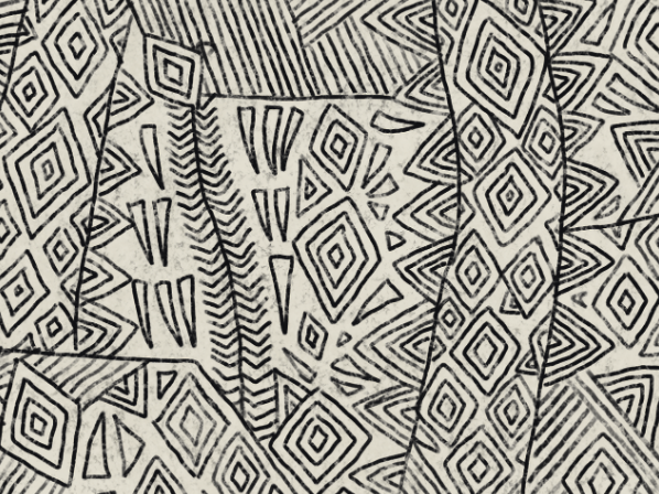
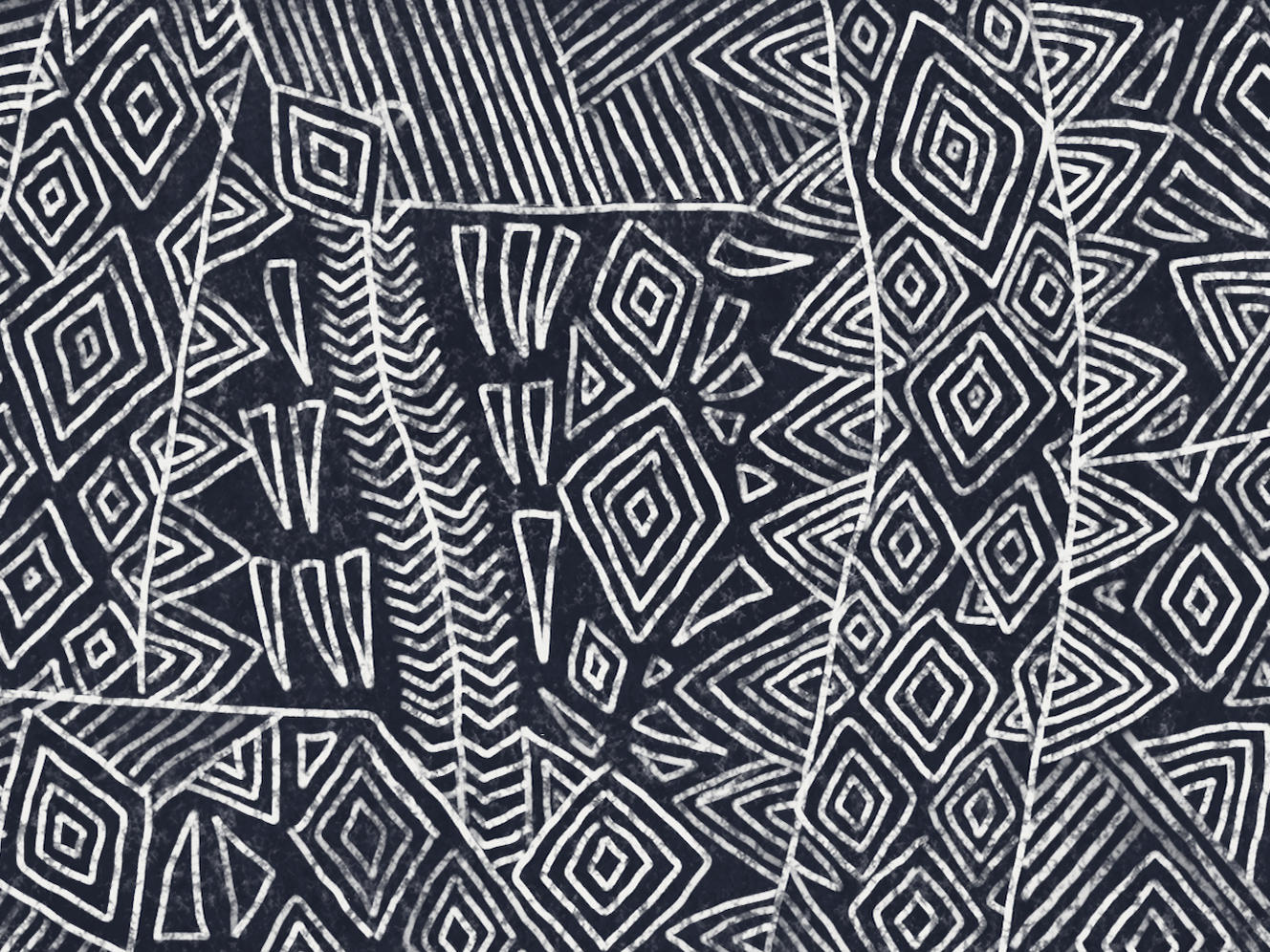
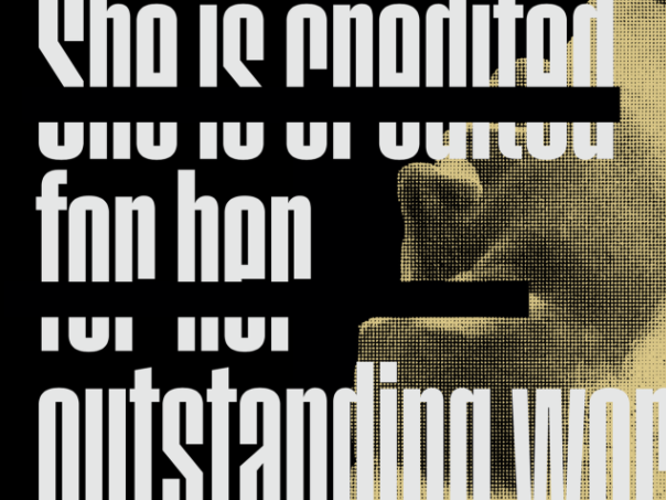
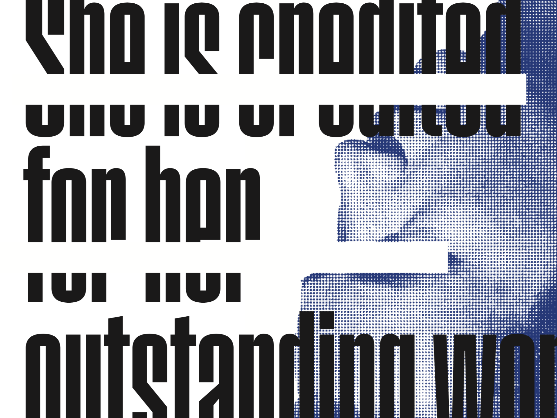
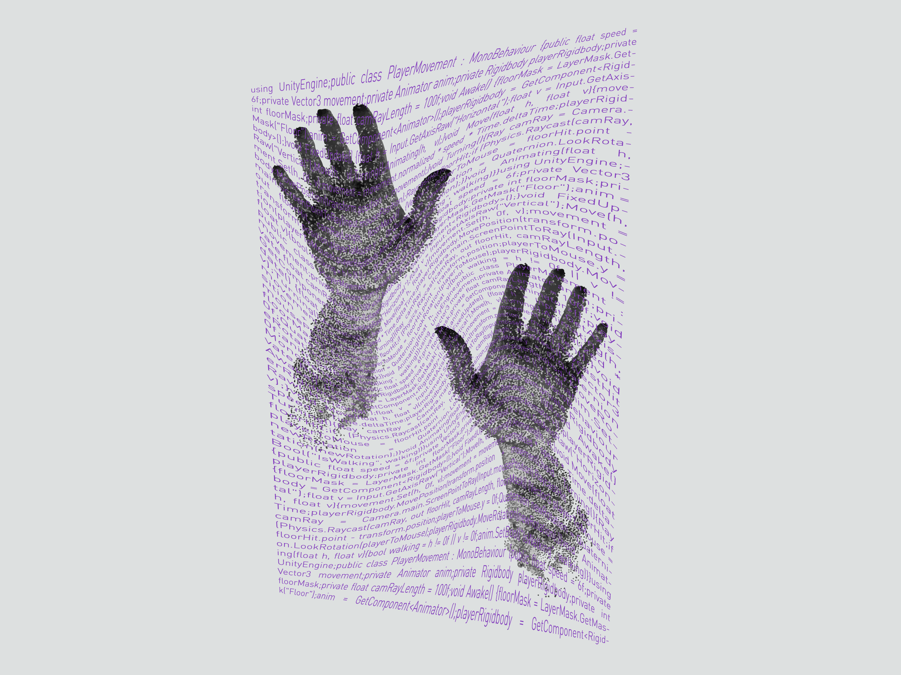
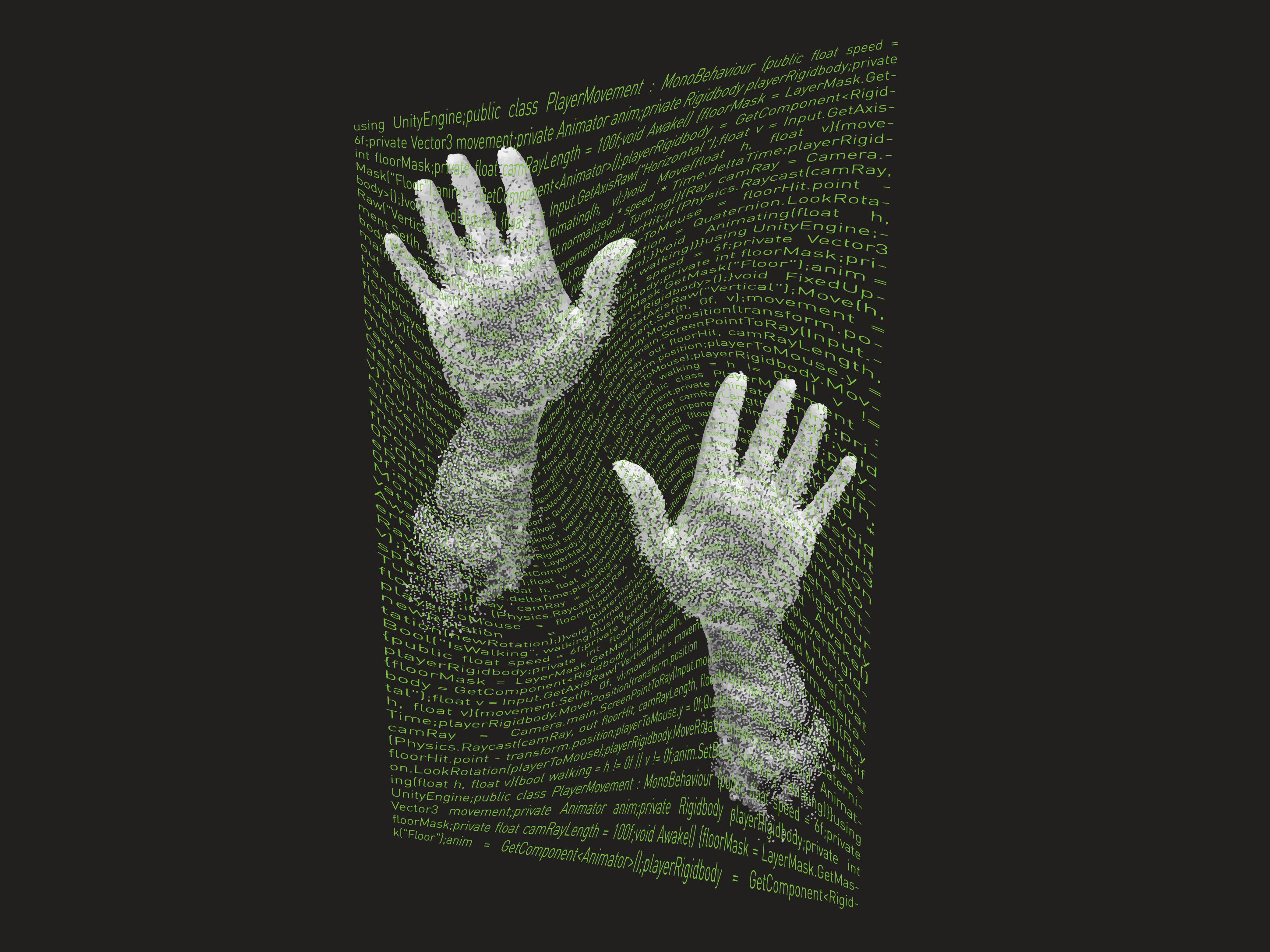
Vinkel is a functional and expressive typeface. It is robust and readable at large and small sizes but has characteristics like flicks and turns that prevent it from being too rigid. Travel app interfaces like Apple maps and Google maps feature typefaces that are sturdy and readable at various sizes, while being friendly and pleasing for the user to read. Vinkel would be an excellent typeface for these applications.
Coded Microsite
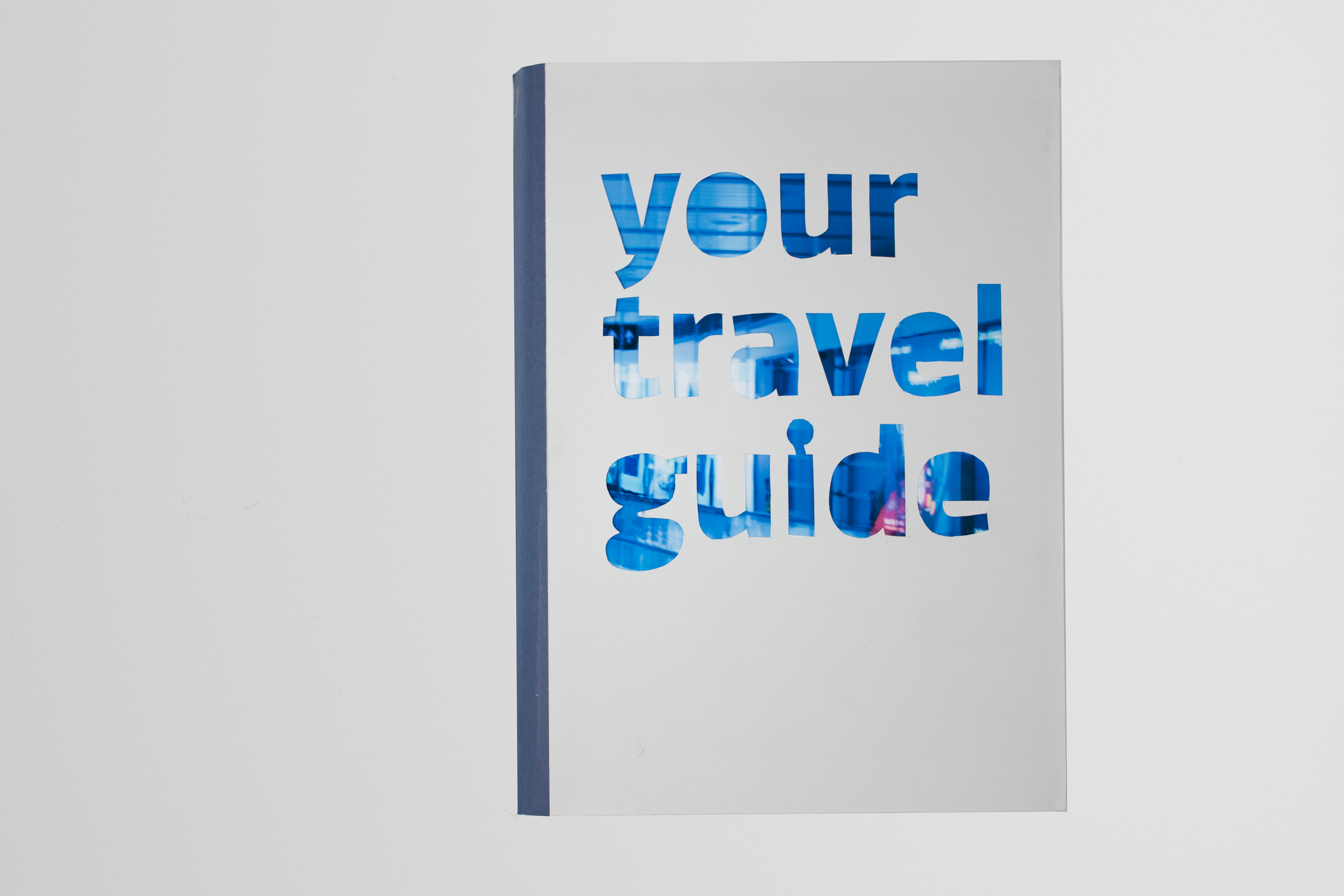
Print Promotion Cover
The usability and friendliness of the typeface in the website promotion is kept to the forefront and developed further in the print promotion, associating its use with the order and ease that comes with finding your way on a journey. The type specimen focuses on people’s travel patterns through photography and the documents they need/read to get where they need to go (a journey in book form).
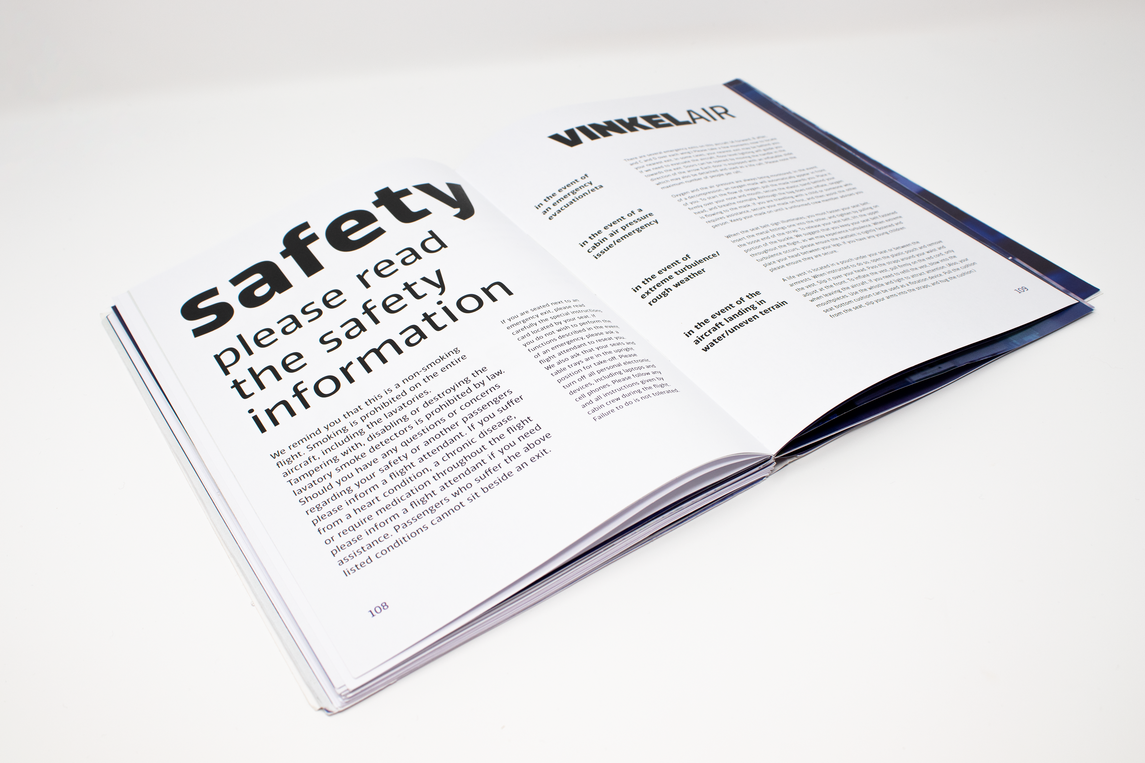
The type specimen structure consists of the glyphset, followed by a journey that requires a bus trip, a train trip and a flight to reach Helsinki, where the typeface designer Saku Heinanen is from. Each stage of the journey is explored through travel documentation and photography of that mode of transport, with the typeface integrated throughout.
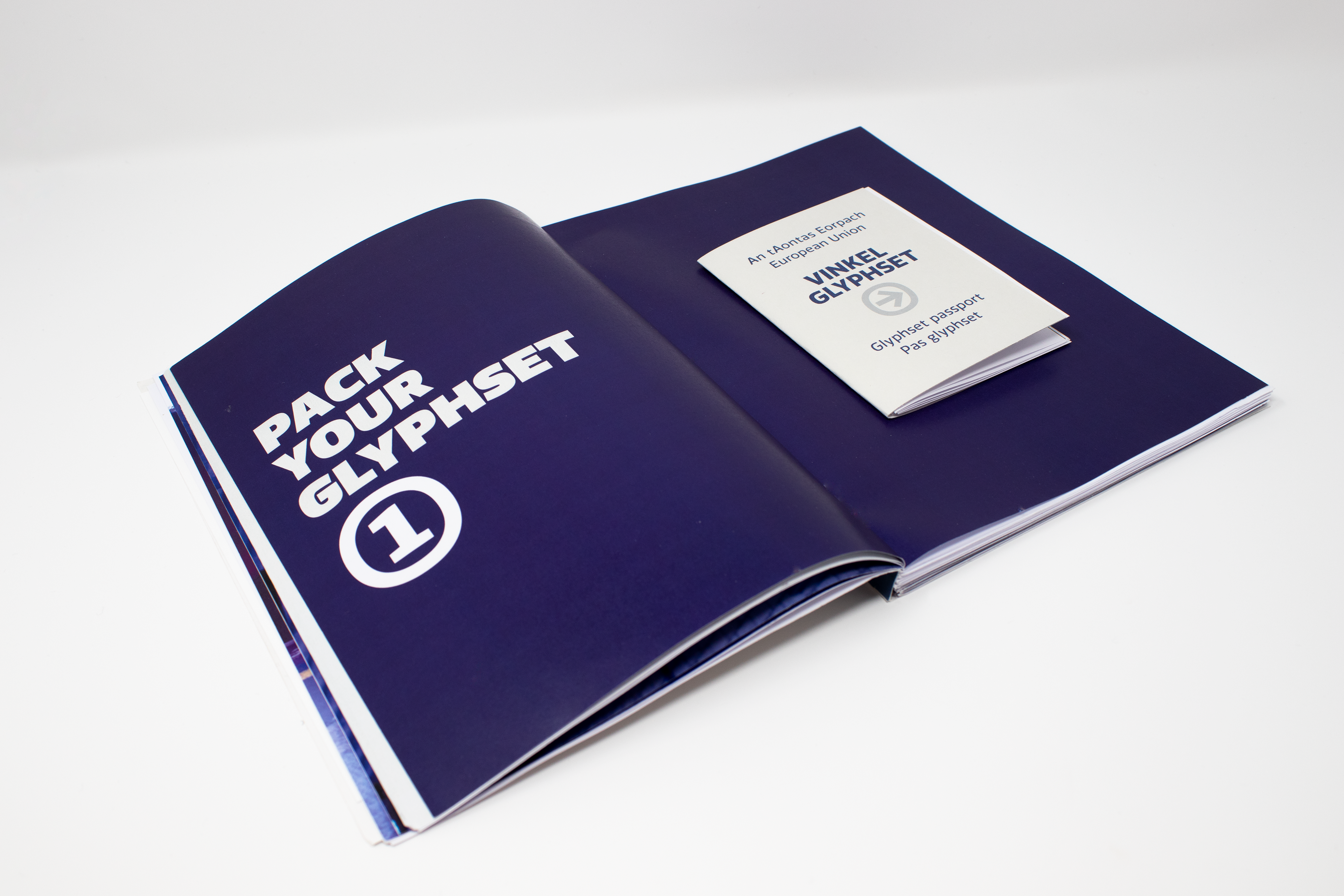
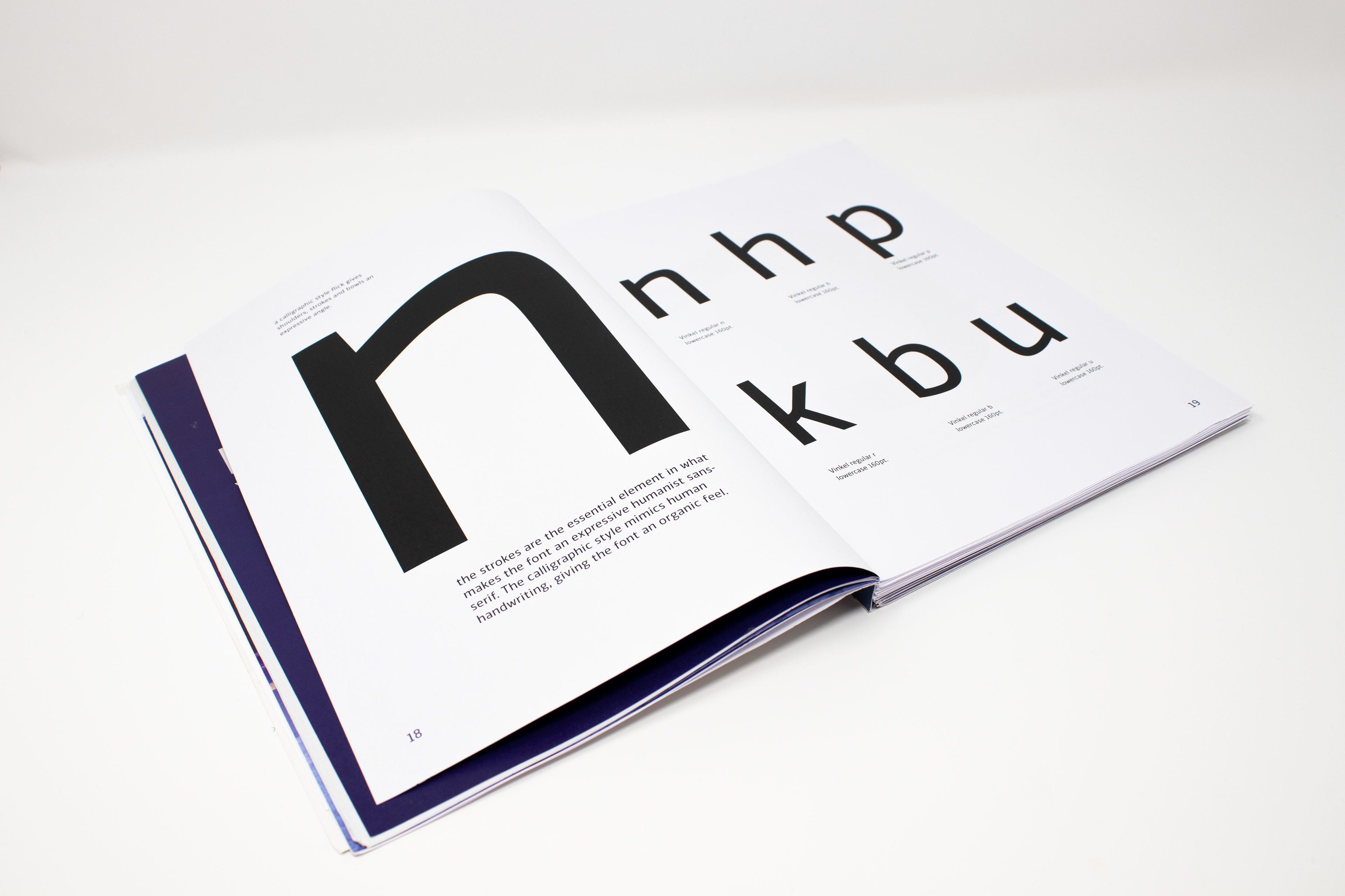
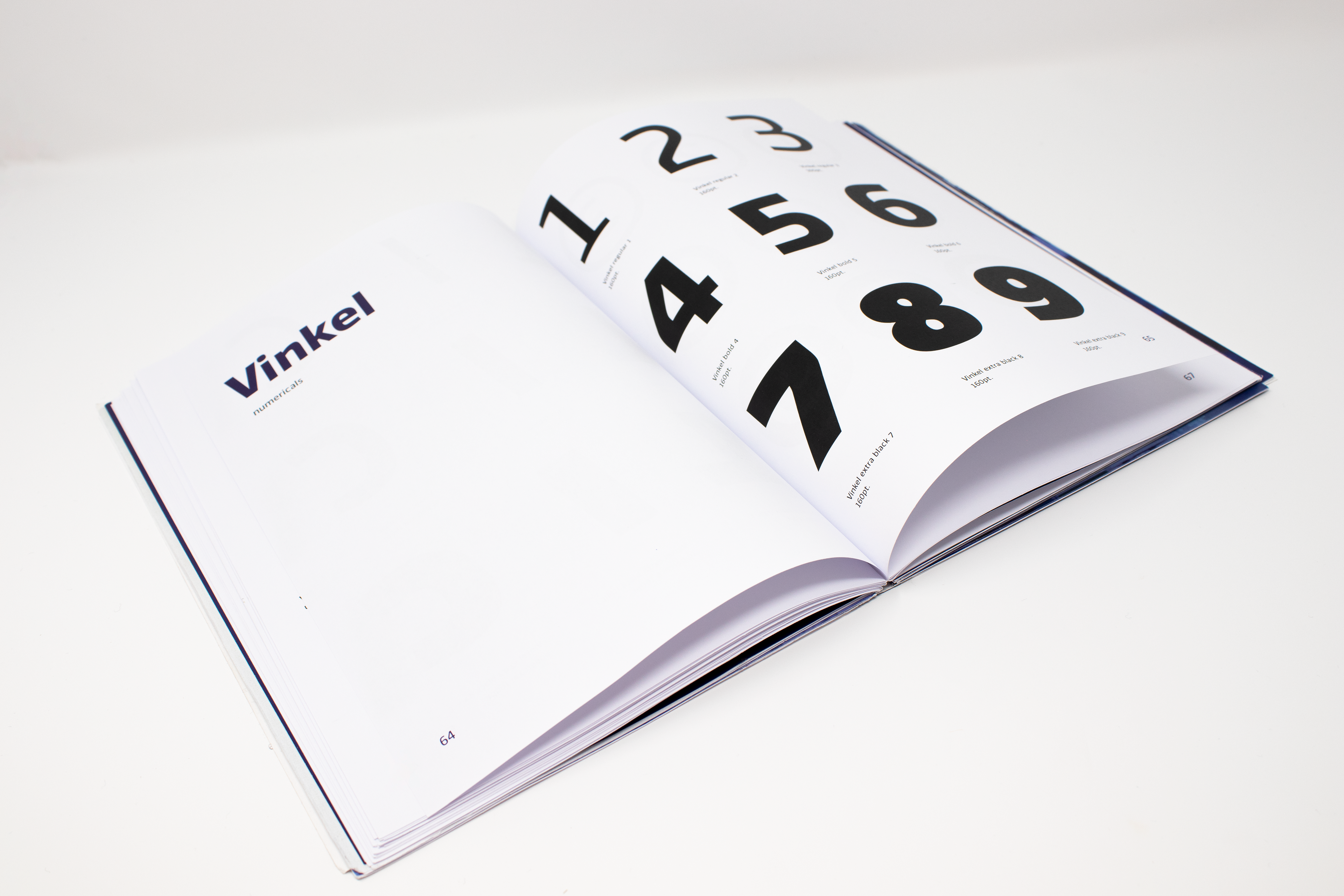
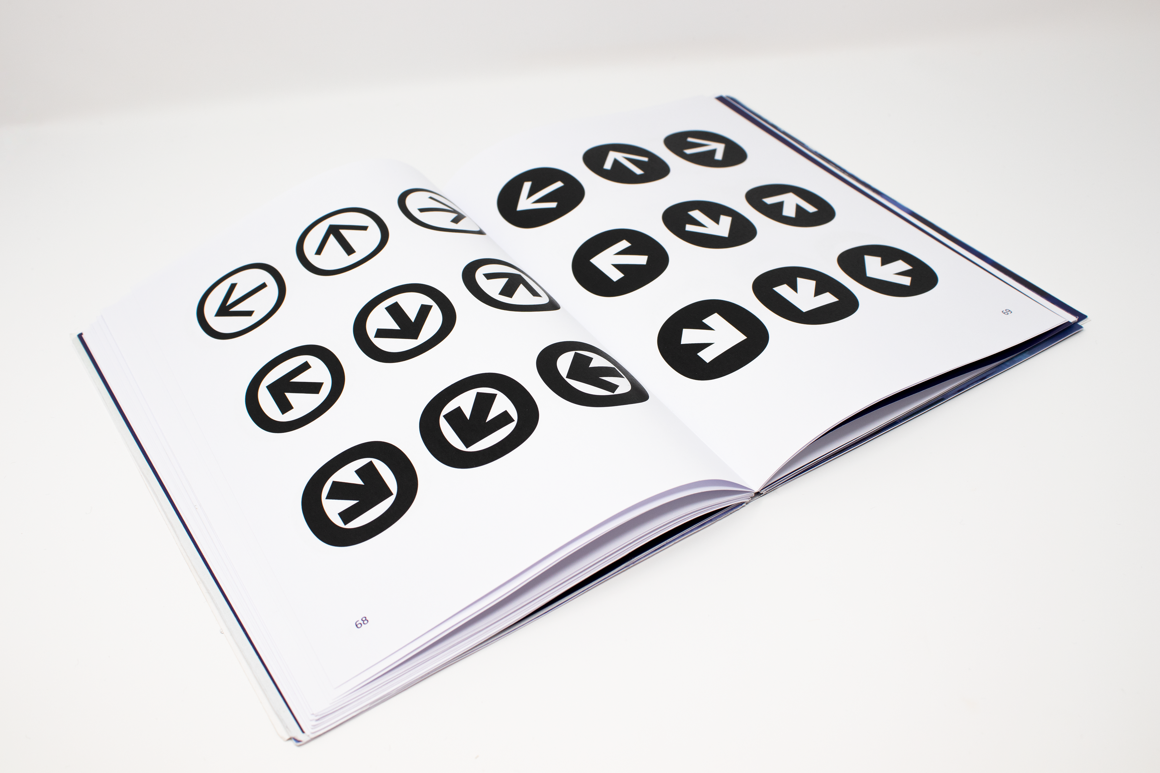
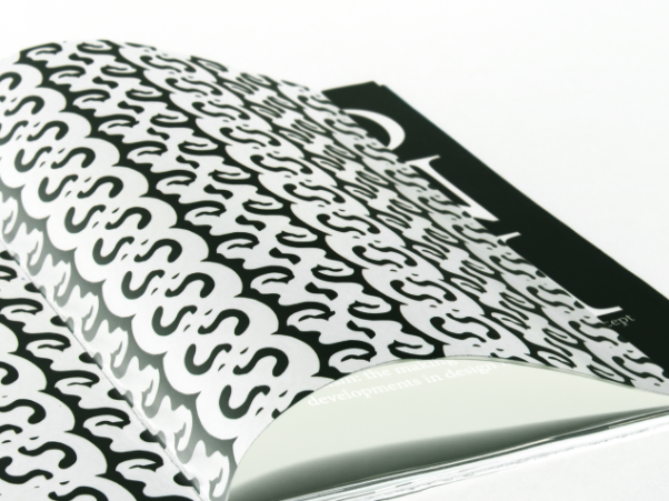
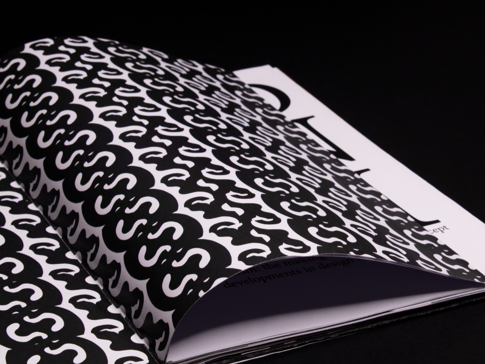
Favourite glyphset spreads
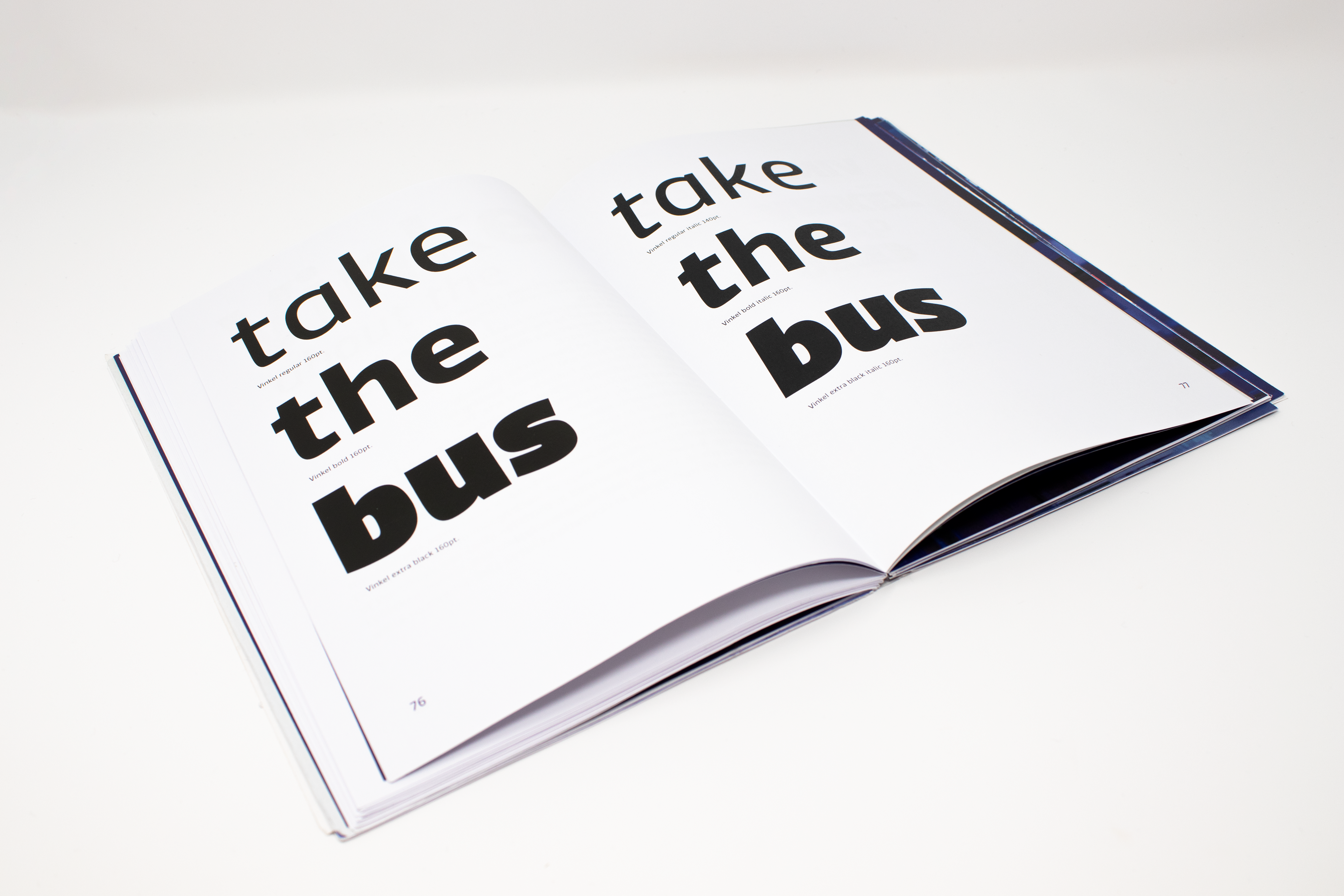
Each part of the journey is clearly indicated; Take the bus, take the train, board the flight.
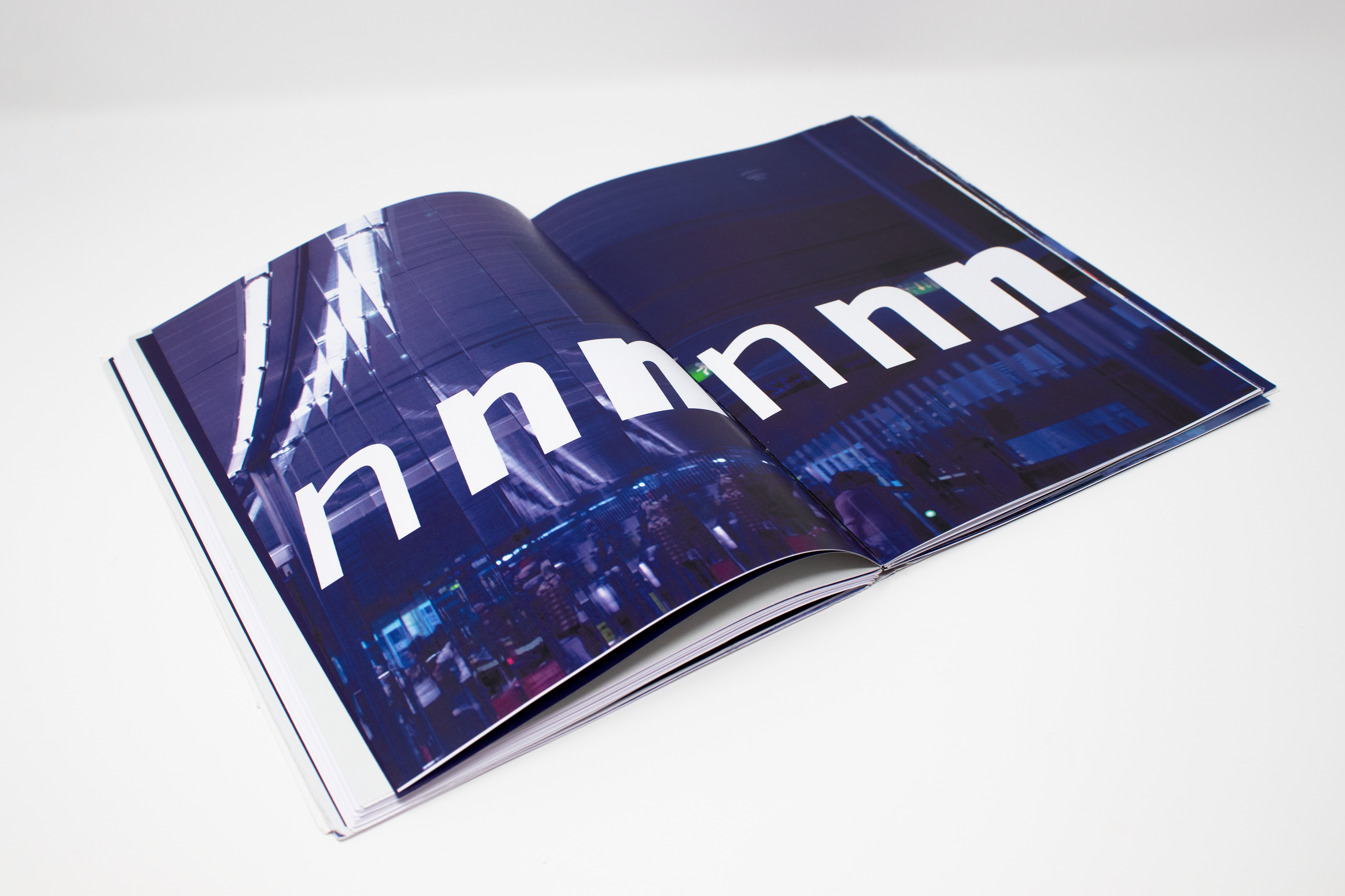
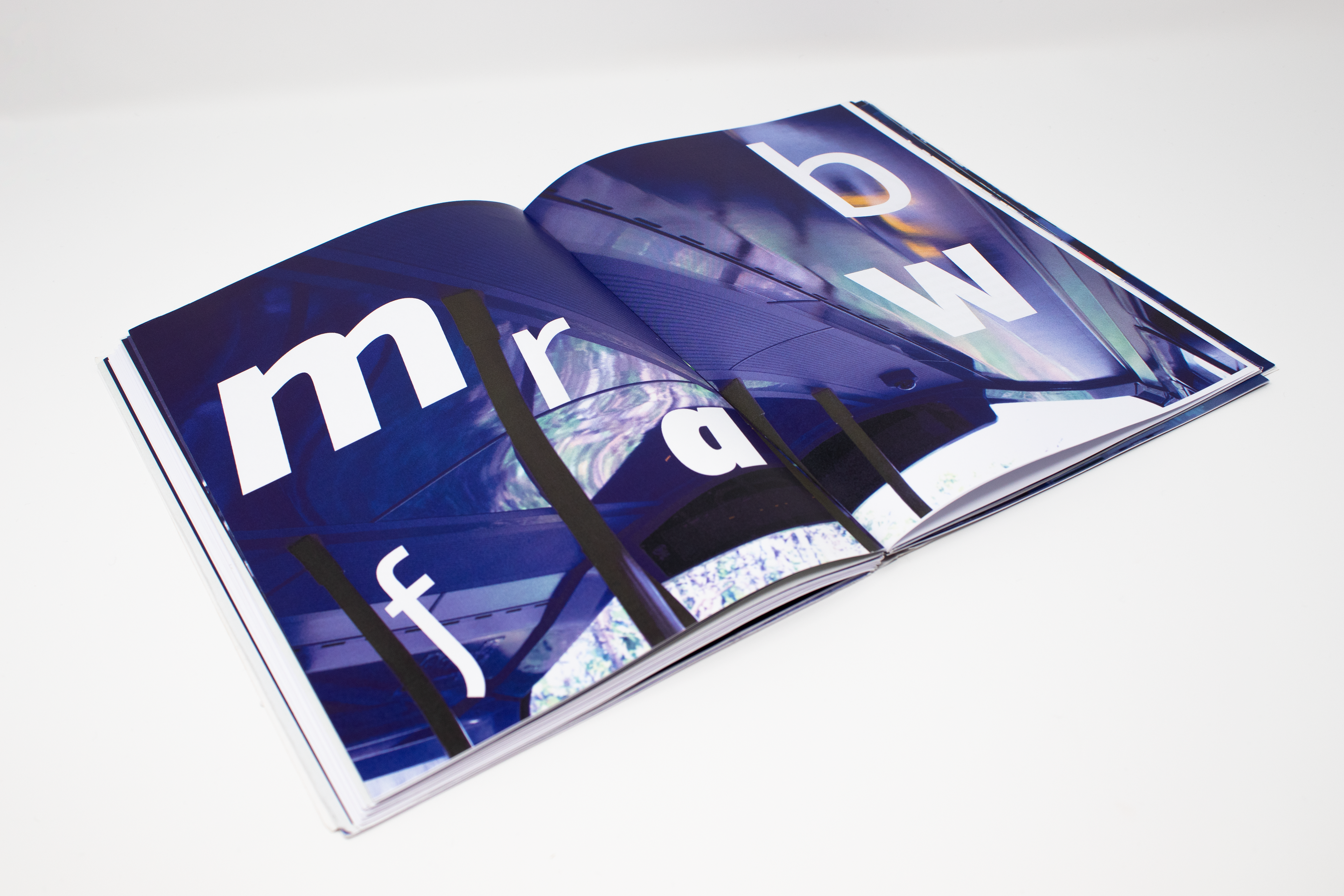
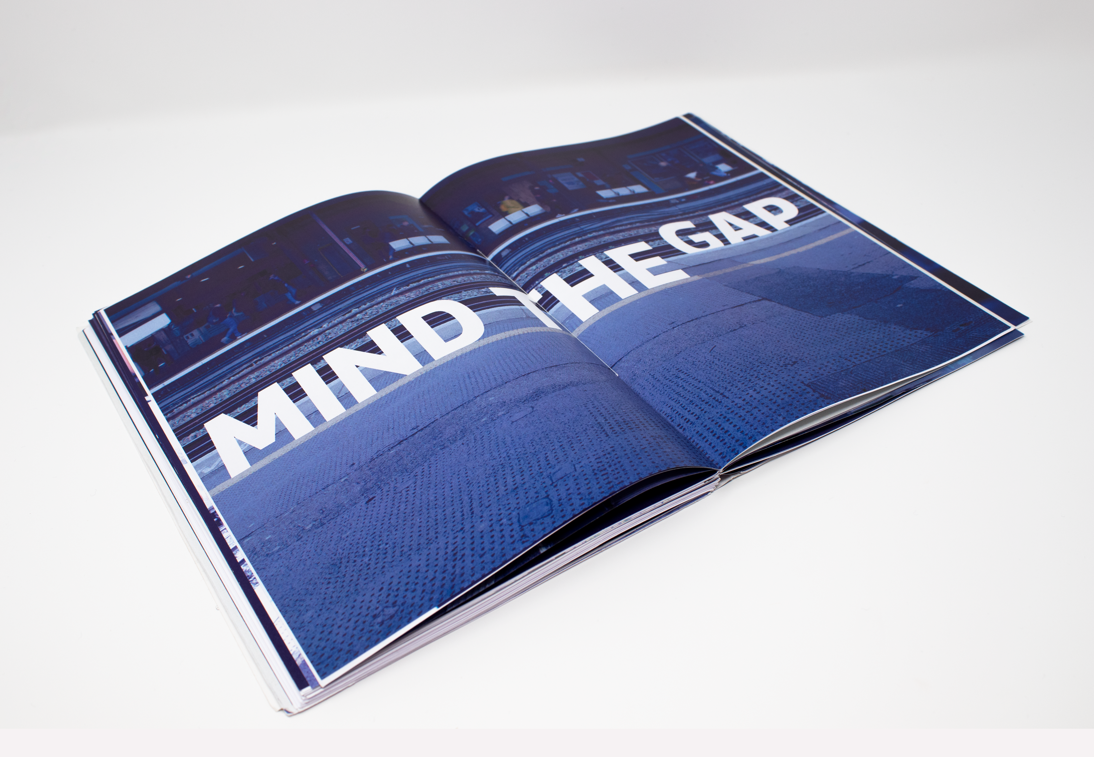
Favourite art direction spreads. Vinkel is integrated into the various surroundings along the journey, from train platforms to airport windows. The photography is original and from one journey.
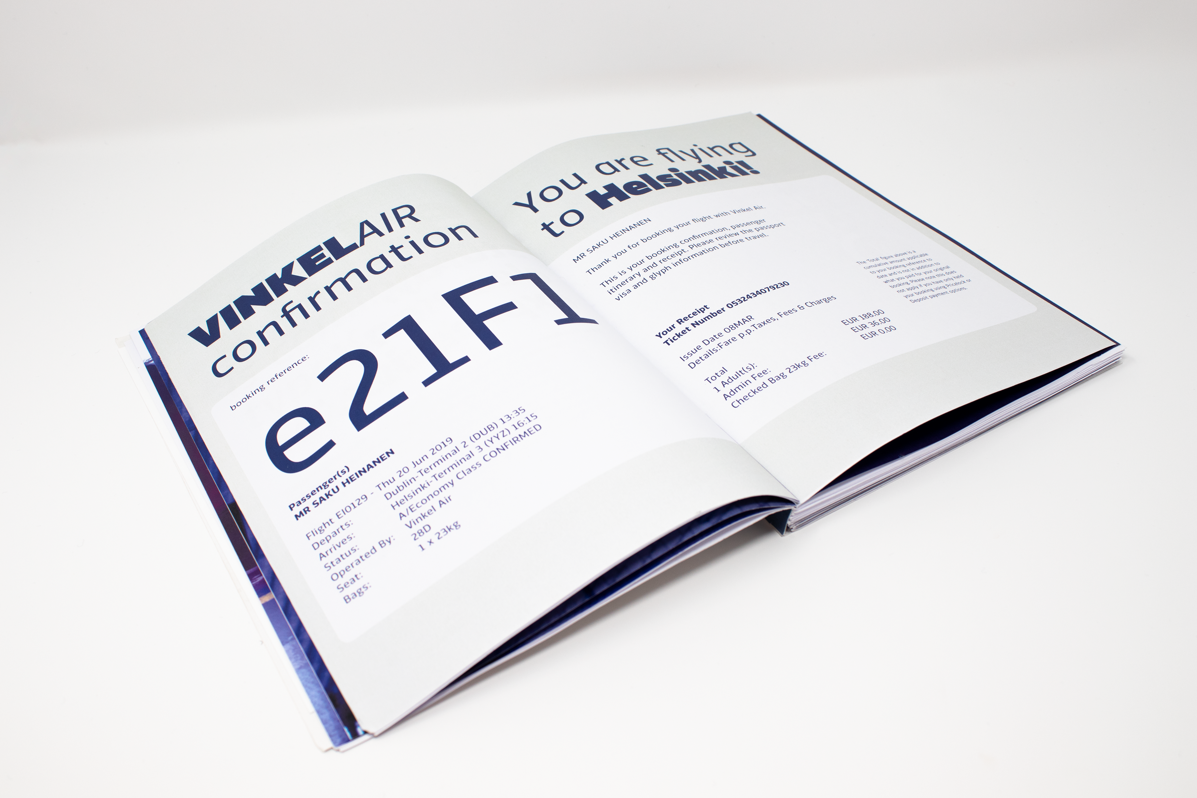
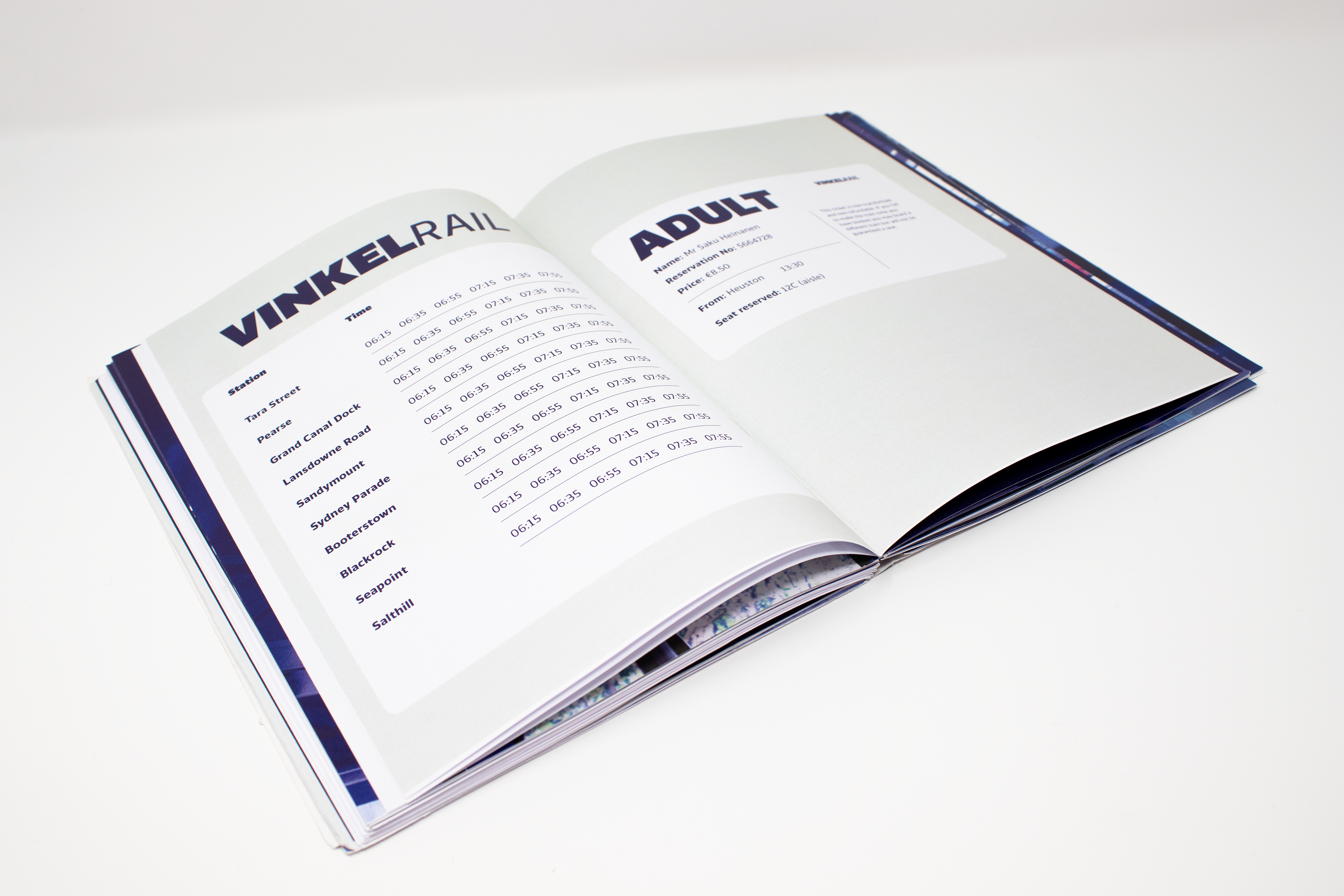
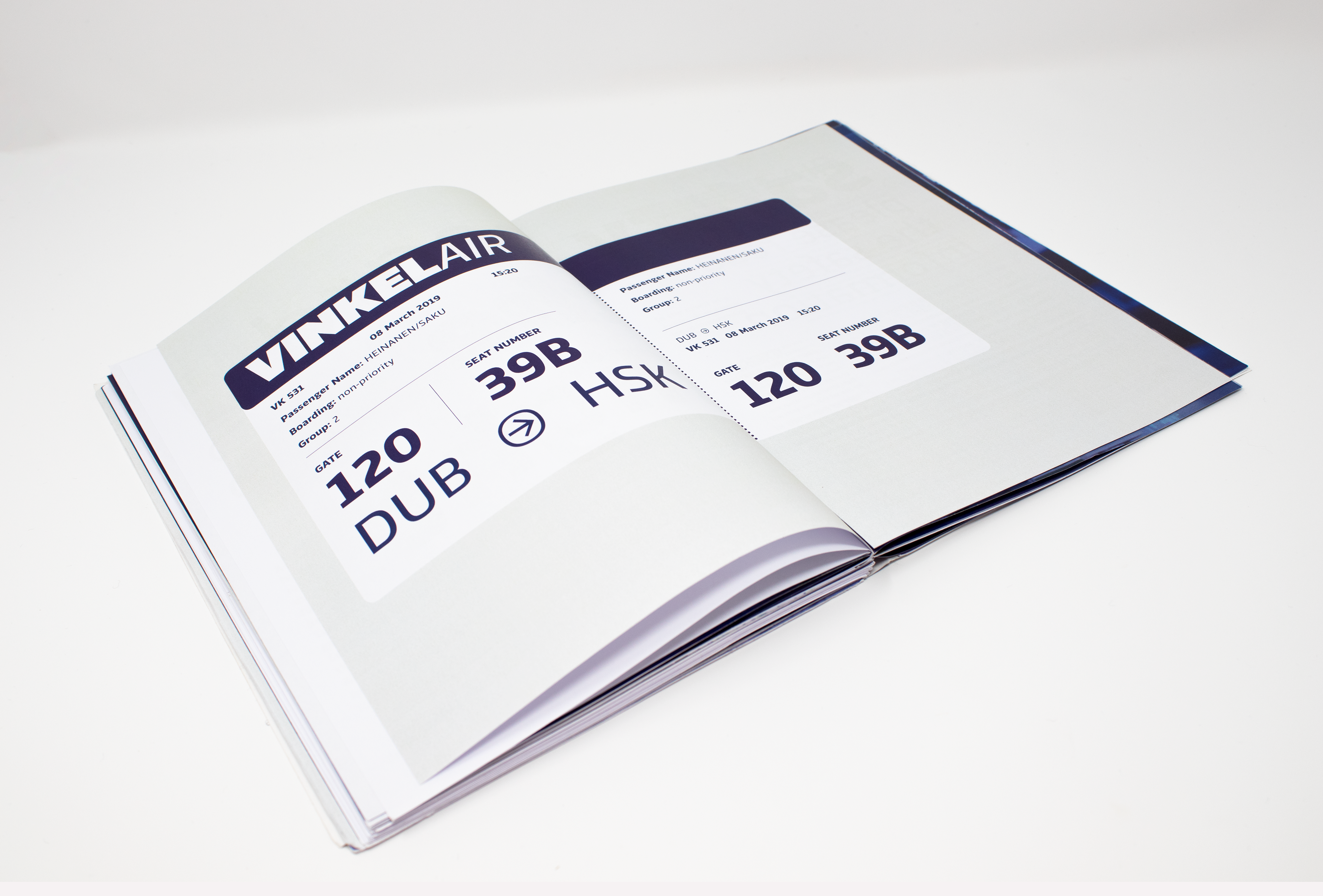
Travel documentation spreads