Visual Identity
Motion
Digital
Iconography
Print
Motion
Digital
Iconography
Team
Vuzkresen Georgiev
Vuzkresen Georgiev
Timeline 4 weeks
While interning at Kubator, Austria, they needed a brand refresh to set themselves apart as a unique marketing agency. It needed to showcase their friendliness, professionalism and small but mighty team of designers, managers and marketers.
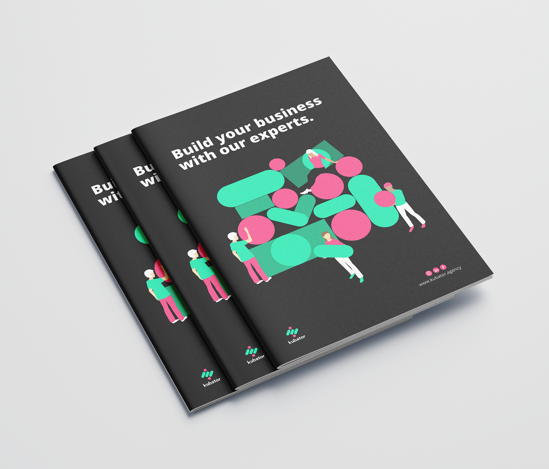
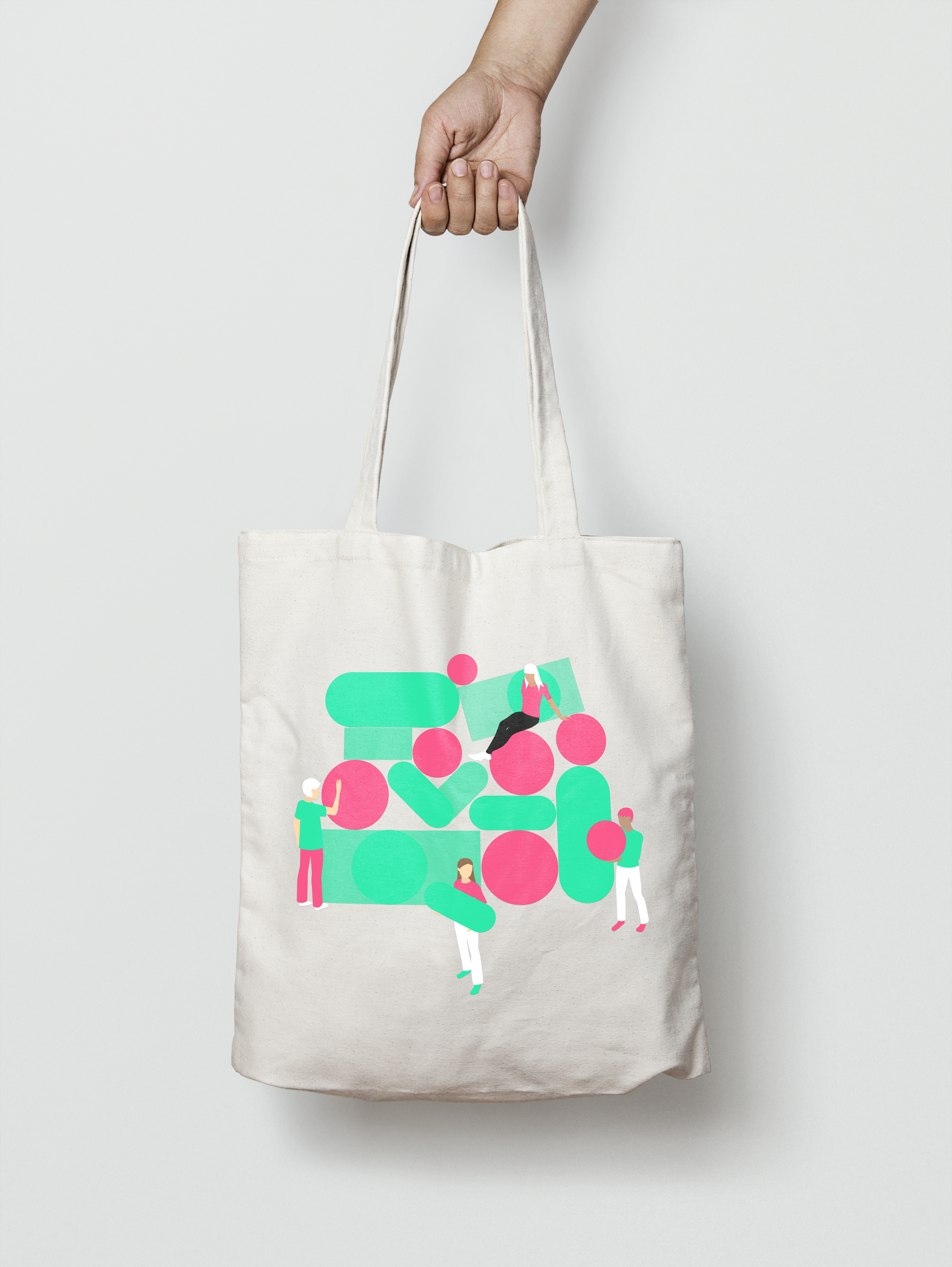
Simple, vibrant graphic shapes that are flexible in their application are paired with approachable, no-nonsense copywriting. A mixture of photographs of the team and illustration keeps the identity human-centred and prevents it from becoming too corporate. The outcome is a brand that is clean, but not cold, professional but not pretentious.
Kubator customises specialised teams with designers, marketers and developers to create the best possible business solutions. They take pride in their strong client relationships and dedication.
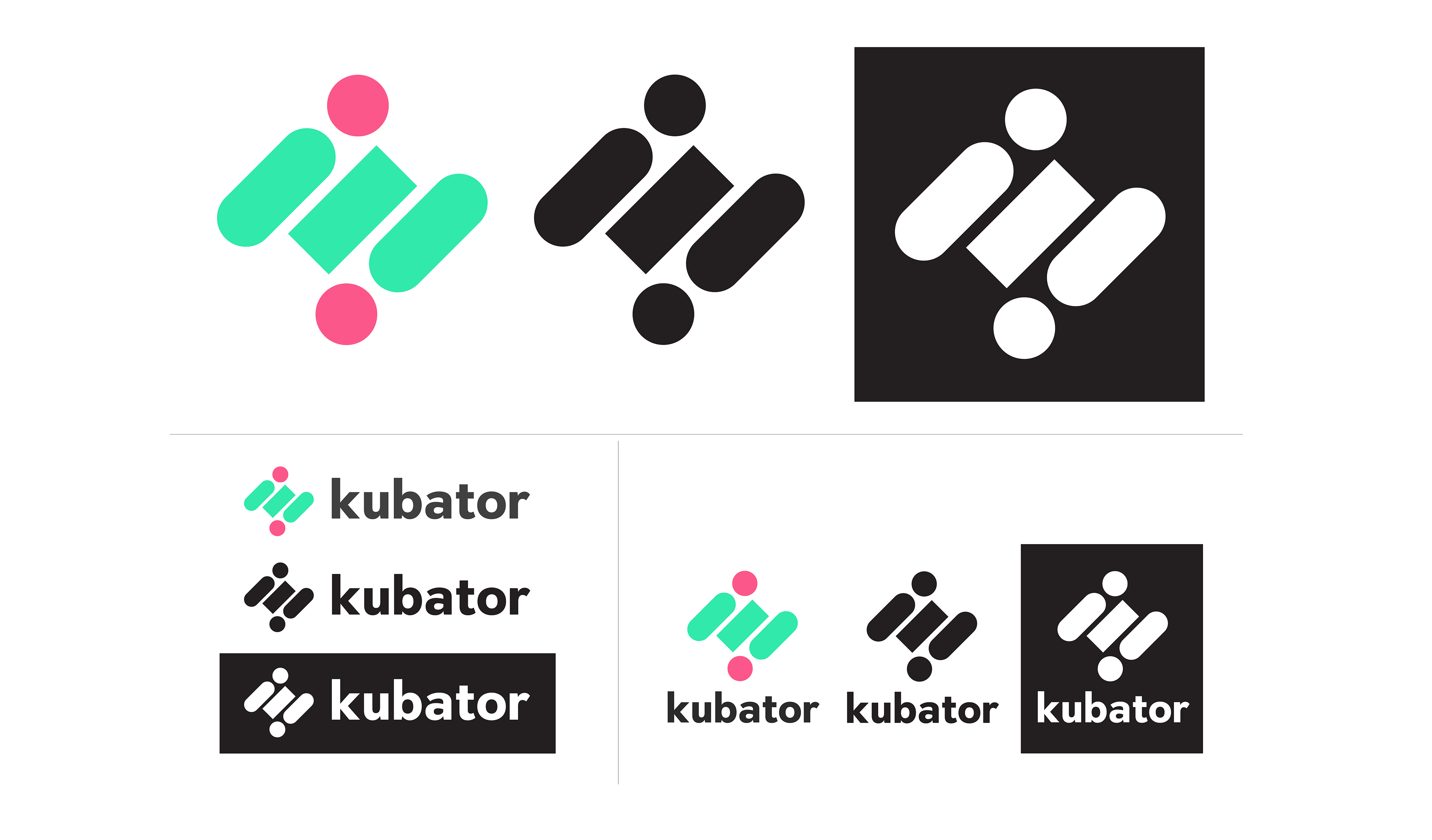
Kubator needed a strong, dynamic logo that represented the logic and creativity that drives their work. They did not want it so rigid it was stale and corporate but not so round and fluid that they would not be taken seriously. The balance is achieved with the mixture of rounded and straight edged shapes.
Kubator's unique selling points highlighted with a dynamic icon set.


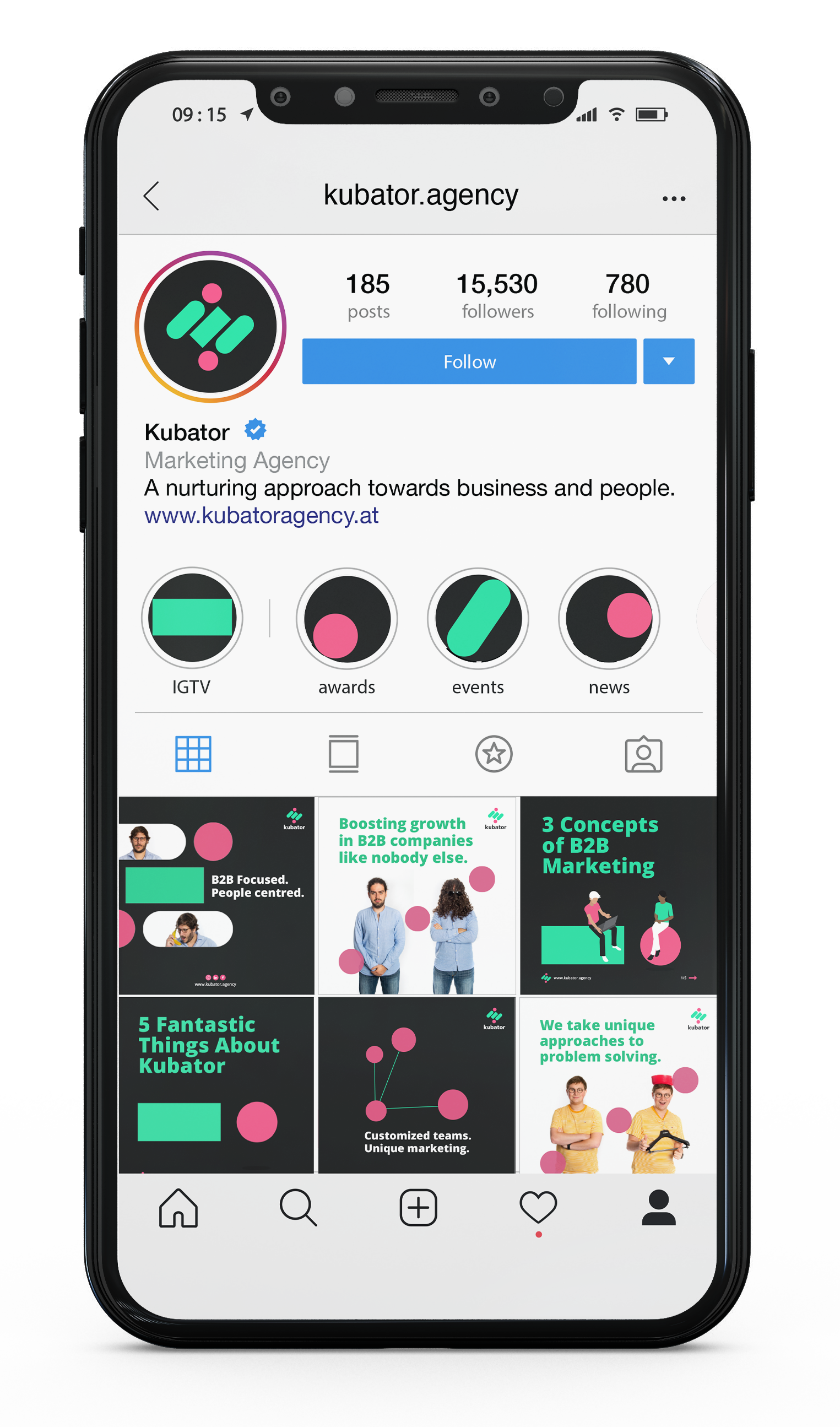
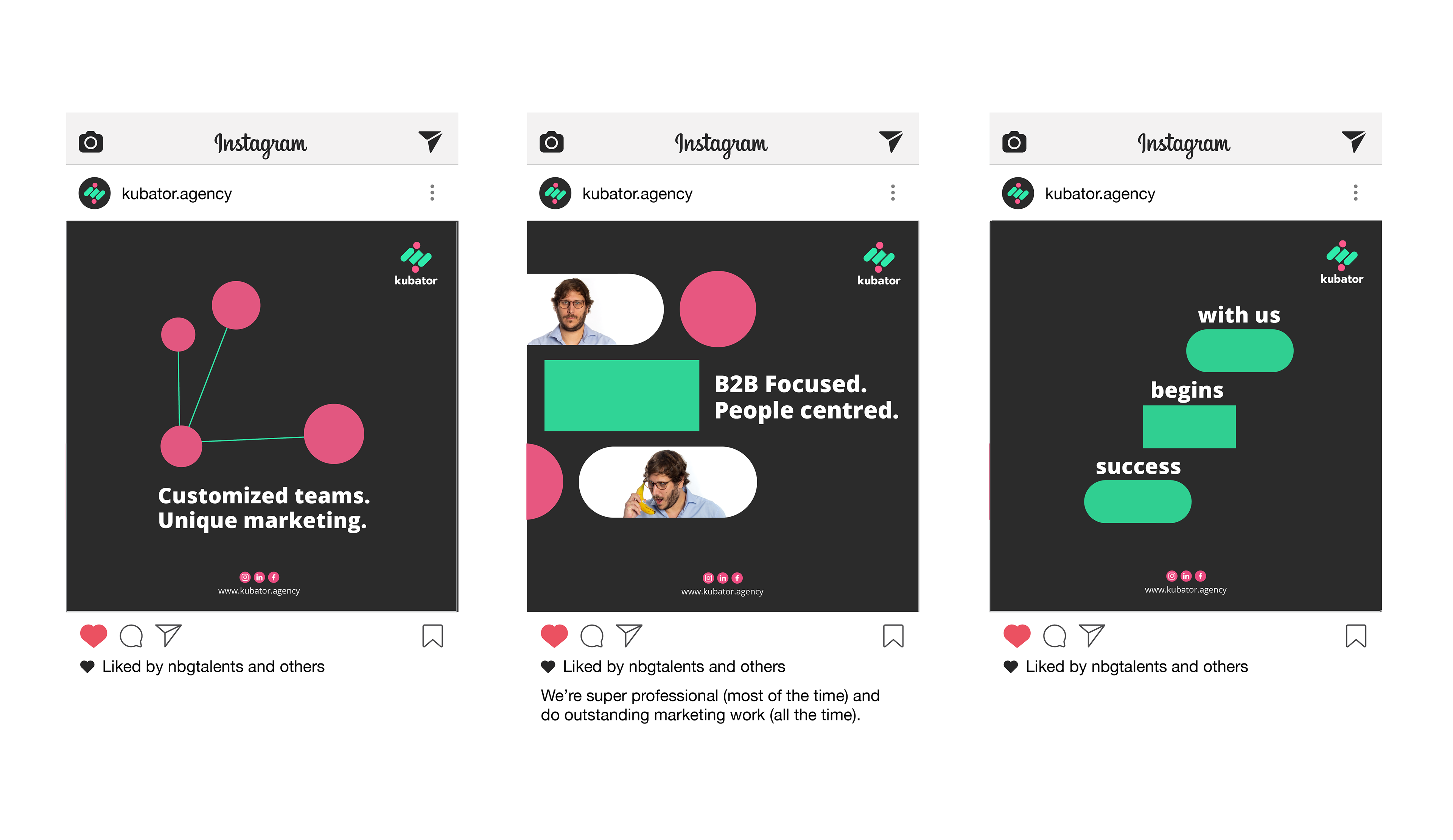
With the vast majority of their promotion being through social media, it was important to keep their feed interesting by mixing it up between graphics, illustration and photography.


They additionally wanted post templates that educated their audience about B2B marketing. It showcases the agency's knowledge while making their expertise more accessible to followers and clients. The choice of typeface had to work well in both English and Bulgarian as the company have a Bulgarian branch.
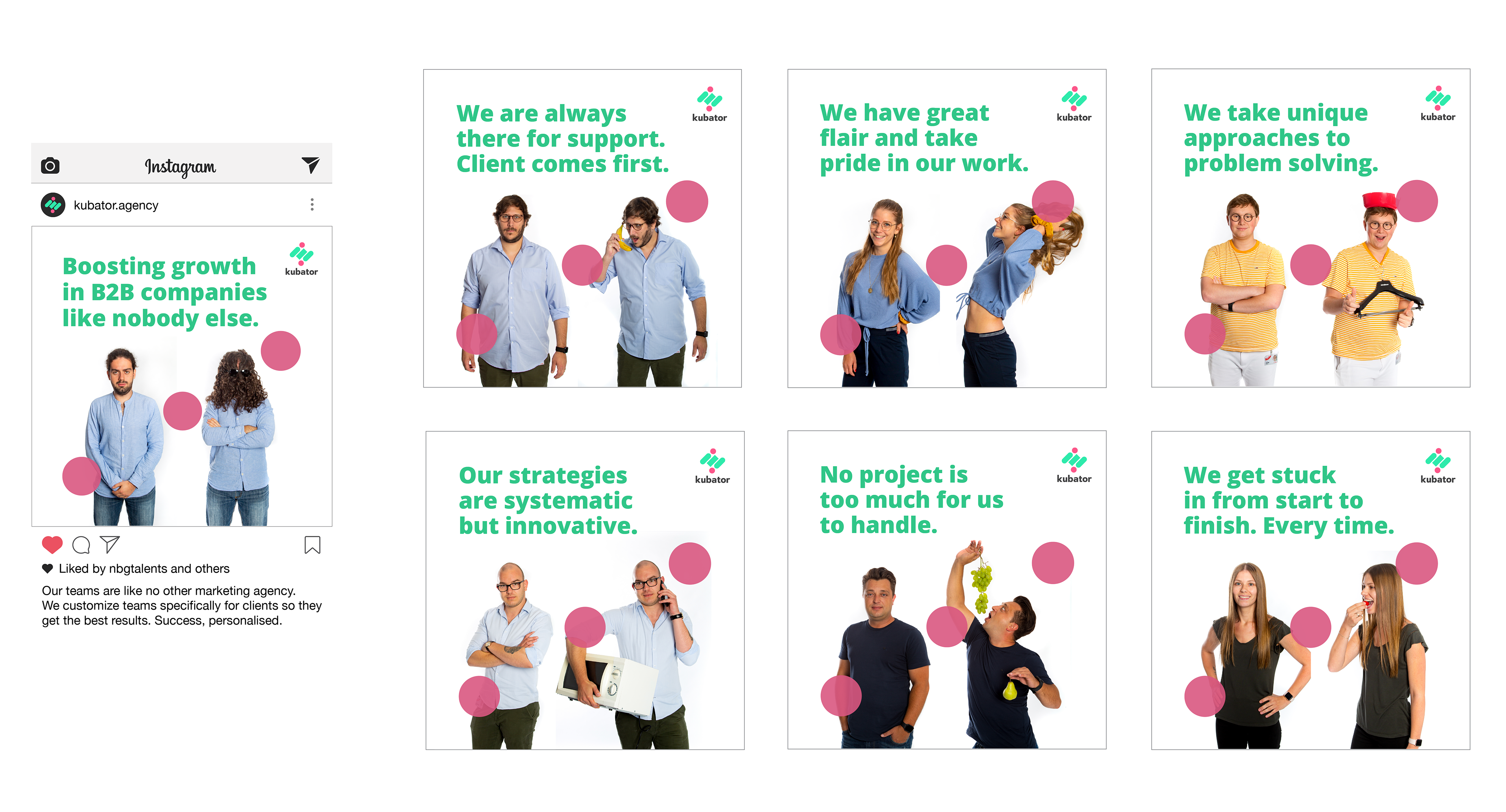
Some of the Kubator team with photographs by Philip Anderl and Assen Georgiev. The photos show both the professional side and quirky side of each person. They poke fun at the fake stock-image feel that corporate photographs can have.
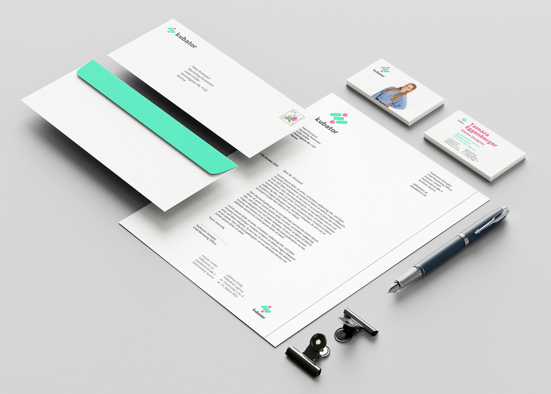
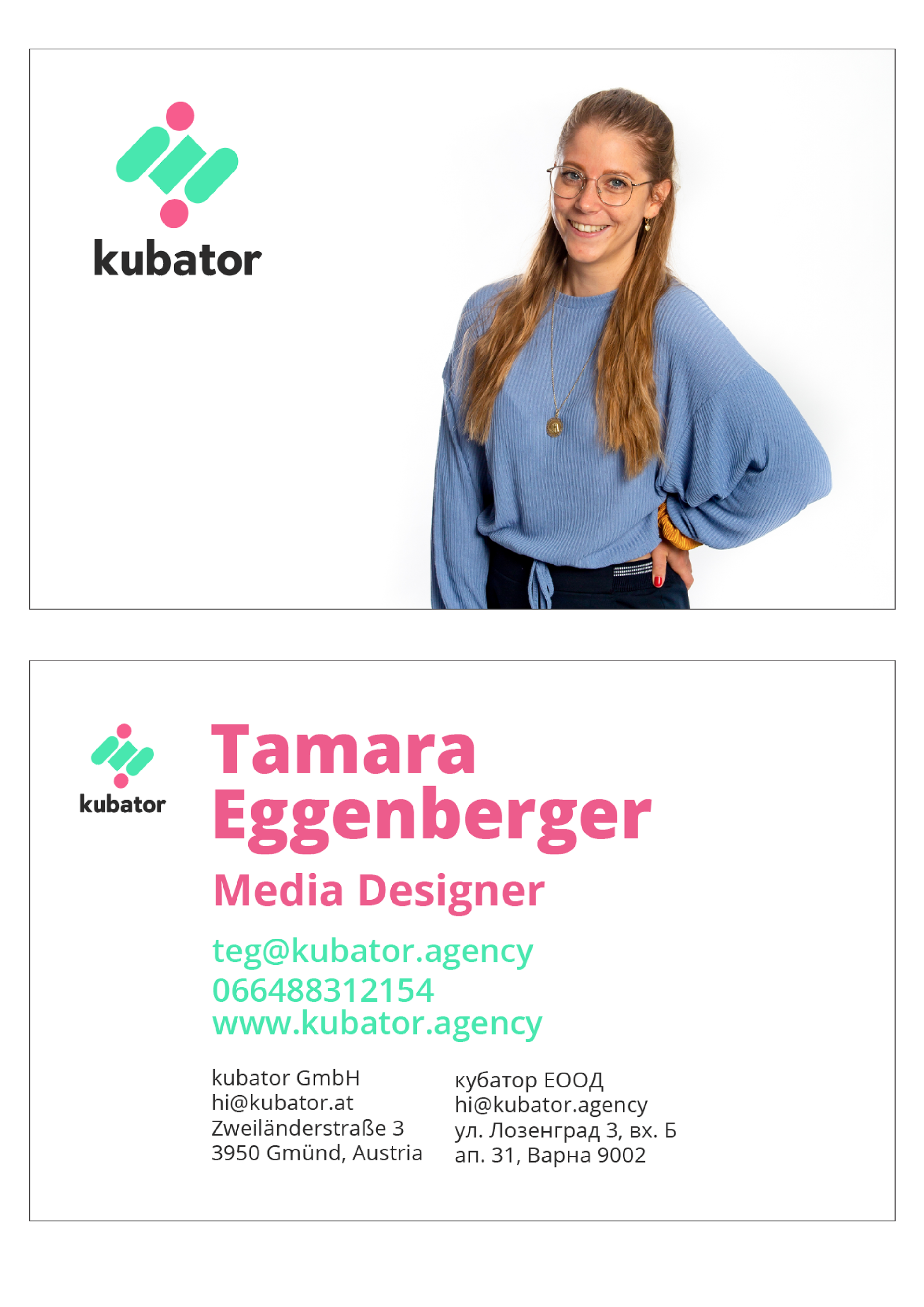
From the start Kubator wanted photographs of the team featured in the rebranded business cards. They found that having a photo of the person on their business card made them more memorable, especially at networking events and conferences where people will meet dozens.
"I love the new Kubator vibe. The rebrand is strong and fresh."
- Christopher Le Roux, CEO of Kubator