Visual identity
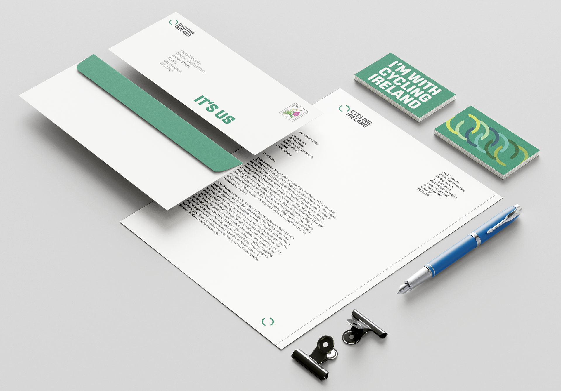
Print
Promotion
Visual merchandising
Wayfinding
Digital
User experience design
Qualitative research
Promotion
Visual merchandising
Wayfinding
Digital
User experience design
Qualitative research
Timeline 7 weeks
Cycling Ireland rebrand competition winner 2019
Cycling Ireland is the governing body of all Irish cycling. Their membership consisted of a strong male majority between the ages of 30 and 60. For the organisation to thrive, they needed to become more inclusive, and reflect this with a friendly, accessible, coherent rebrand that brought six types of cycling together.
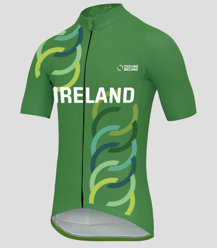
Cycling Ireland also wanted to build on its strengths, showcasing their strong sense of community, their capability as an organisation and to promote cycling itself. Chunky type, colour and clean lines paired with encouraging language make up a simple, inclusive, friendly and flexible system across its platforms, giving the organisation longevity and vibrancy.
The dynamic circle represents the motion of a bike wheel, with the gaps conveying the organisation's openness. The break in the circle reflects how many stop cycling for a period then pick it up again.
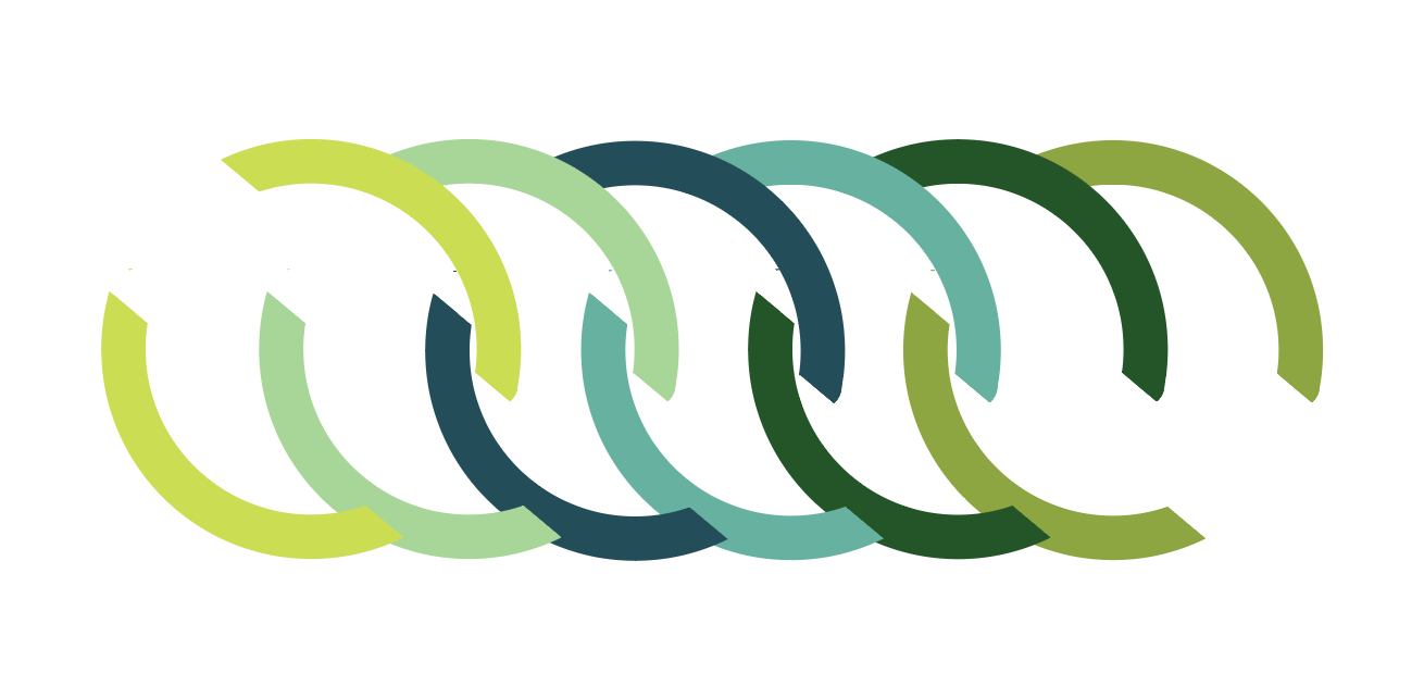
The system unifies the various disciplines Cycling Ireland represents while allowing them to shine individually.
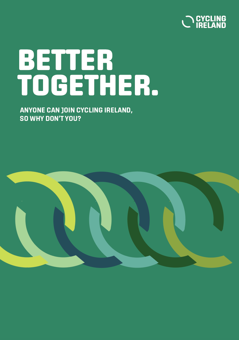
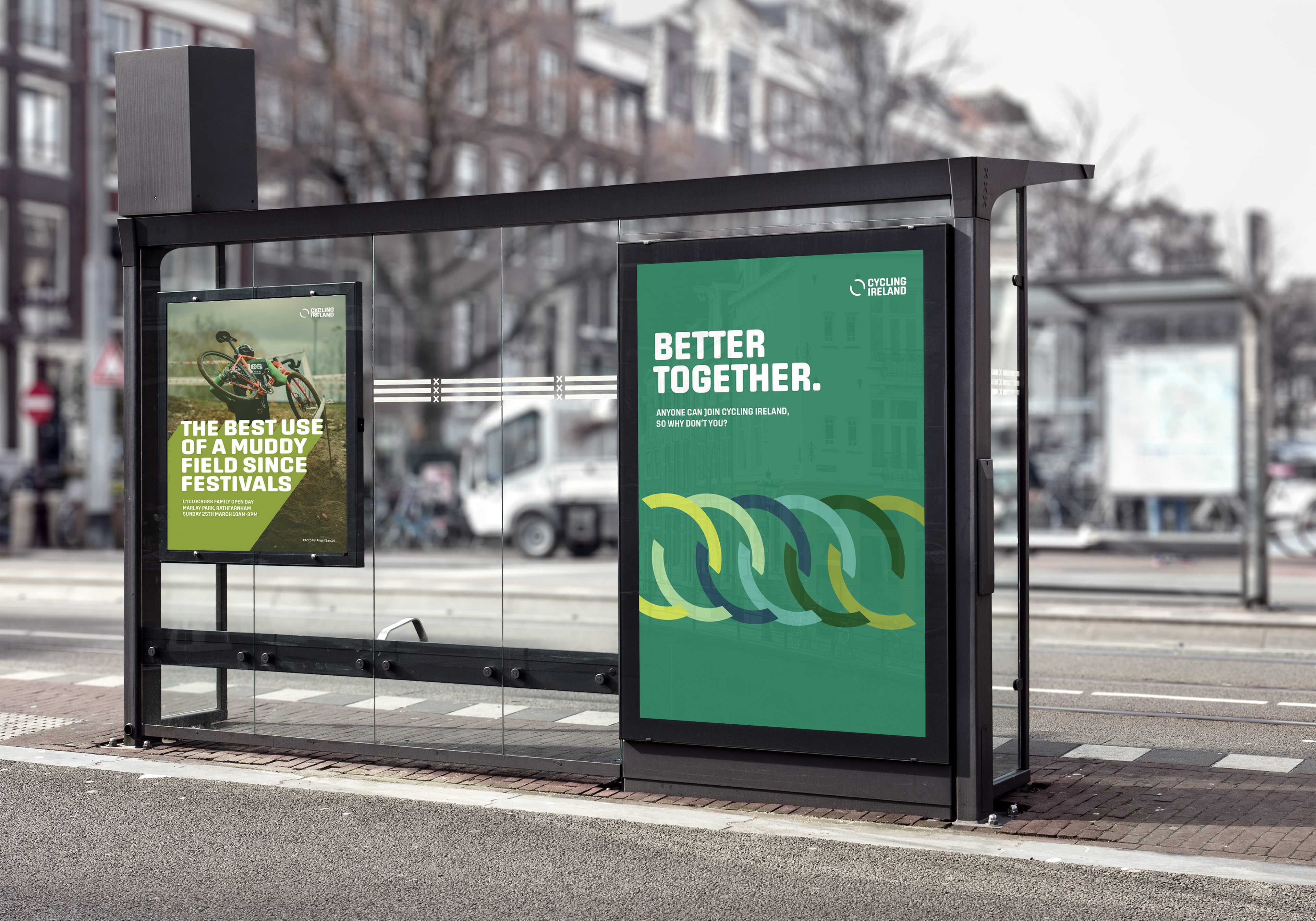
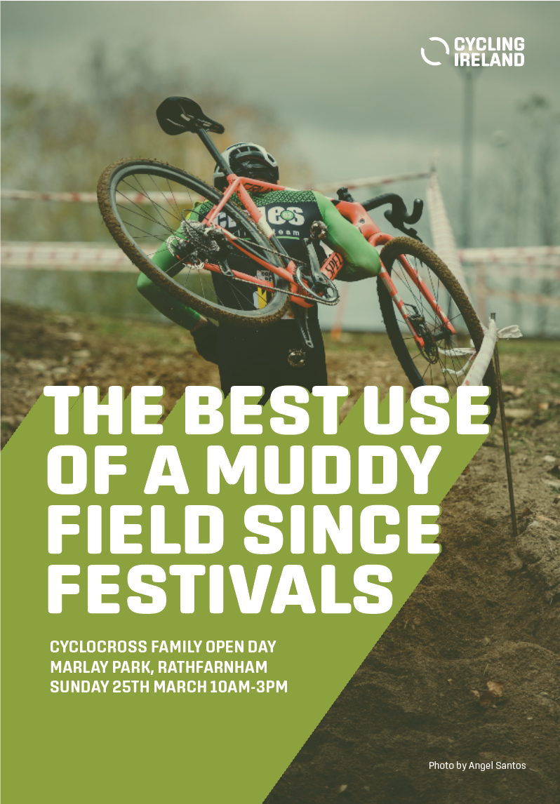
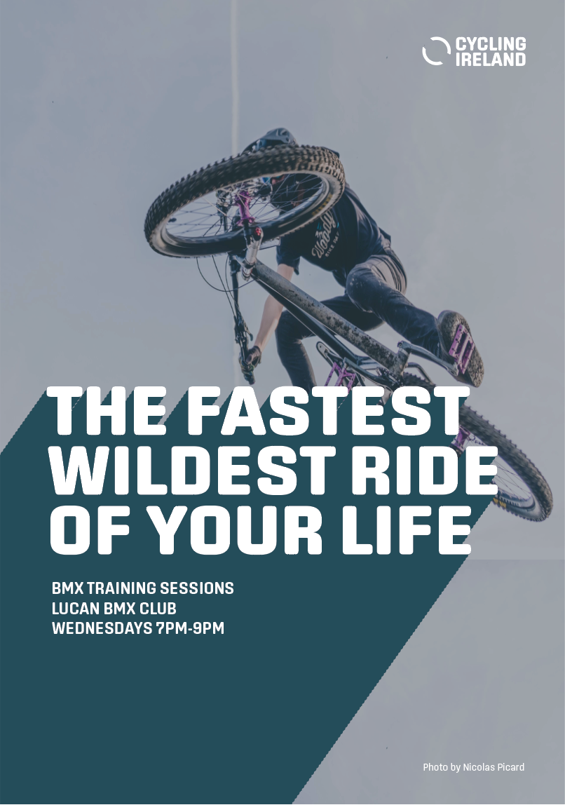
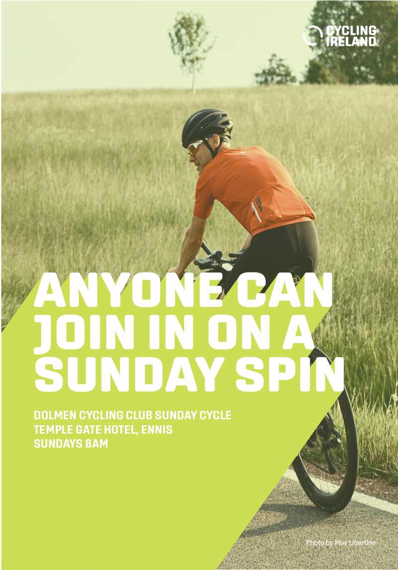
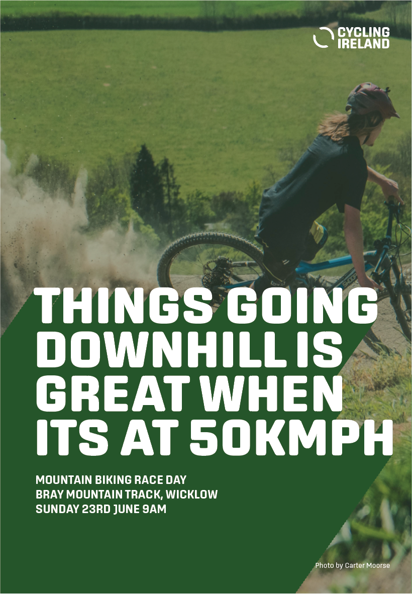
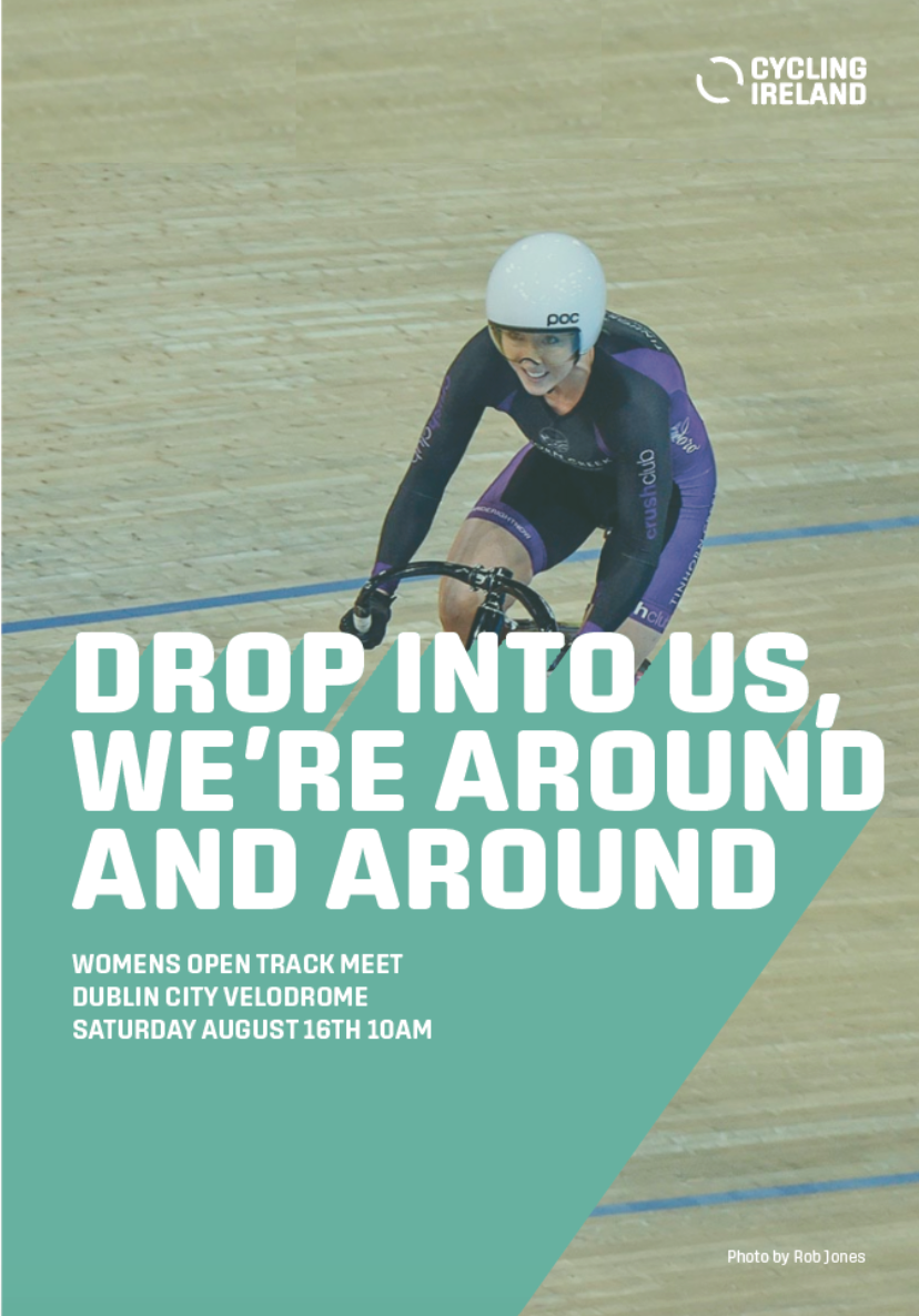
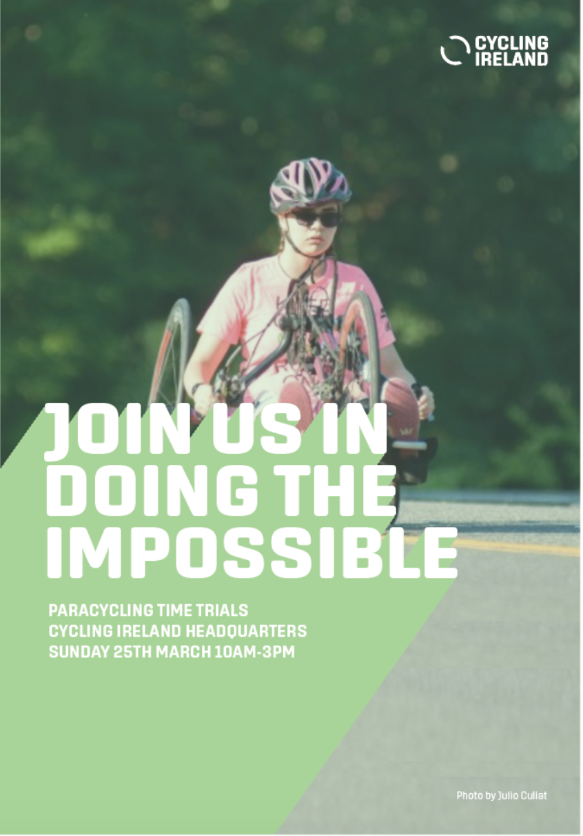
Cycling Ireland’s audience is broad, including all ages, levels and genders. Inclusivity and an encouraging tone of voice is essential. This features heavily in the poster campaign, which is packed with encouraging, fun copywriting.
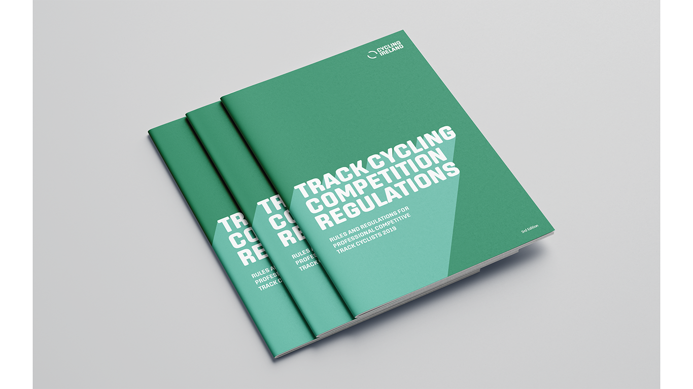
The identity can be simplified when necessary. While the promotional posters are busy and vibrant, booklets containing important information and documentation are more stripped back.
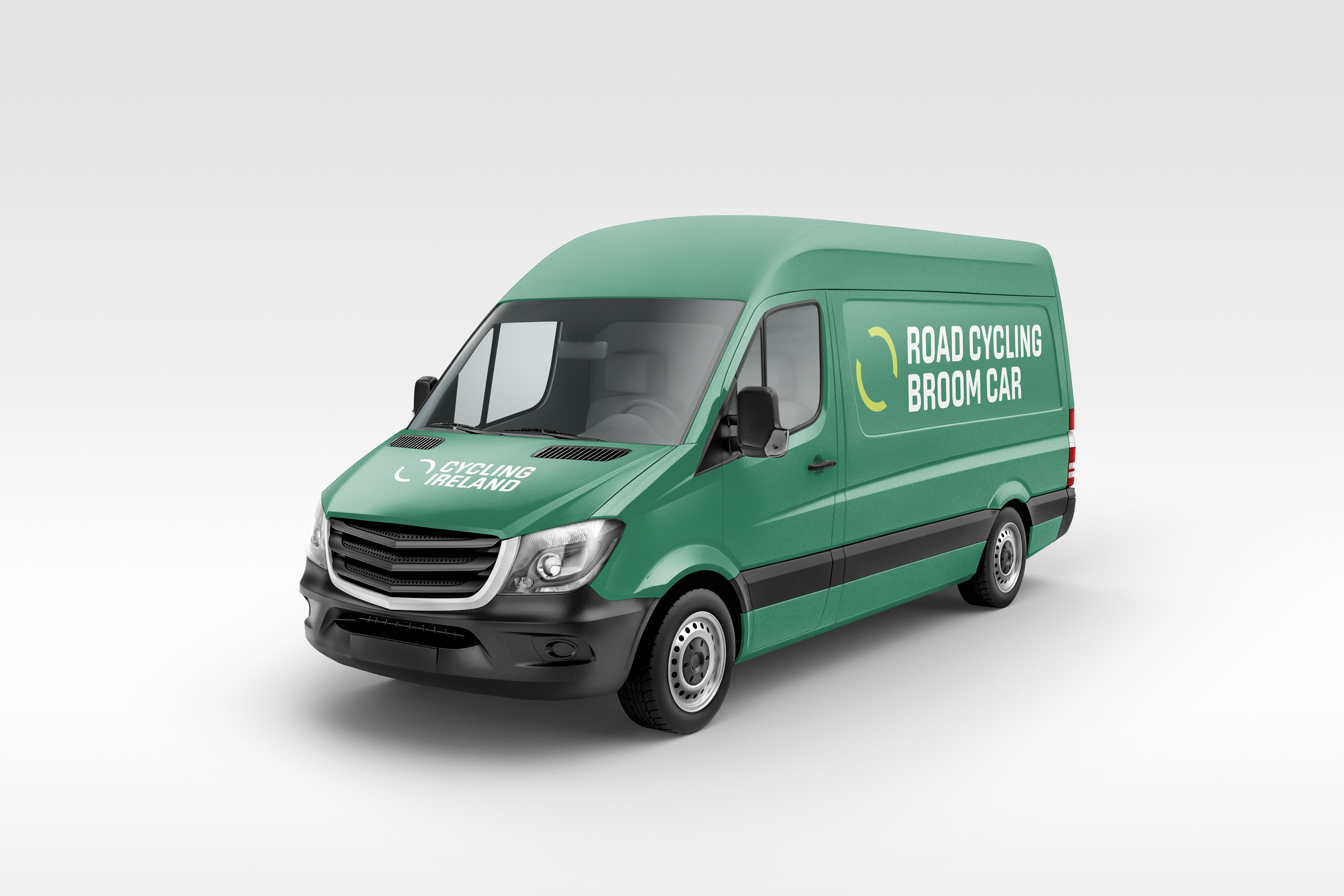
Cycling Ireland is a governing body, as well as Ireland's cycling representative internationally in competition. They provide insurance and assistance for cyclists/cycling events on a nationwide scale and are an advocate for safe road usage. With such responsibilities, the brand must have a strong presence, with authority and trust as well as personality.
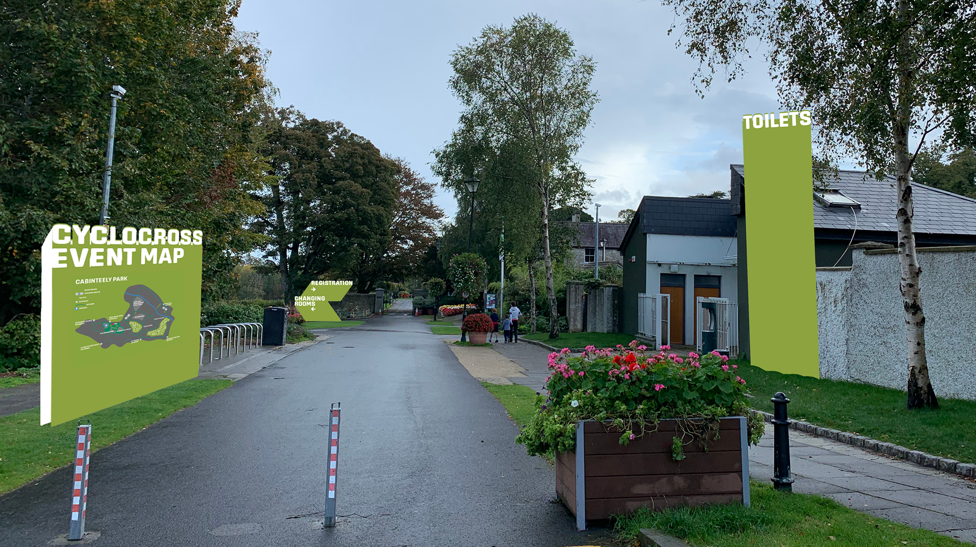
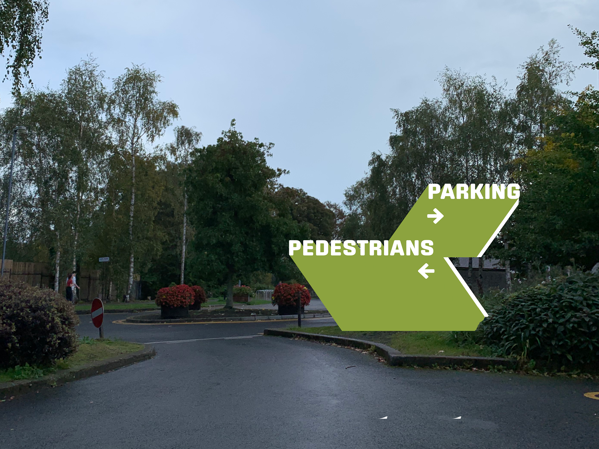
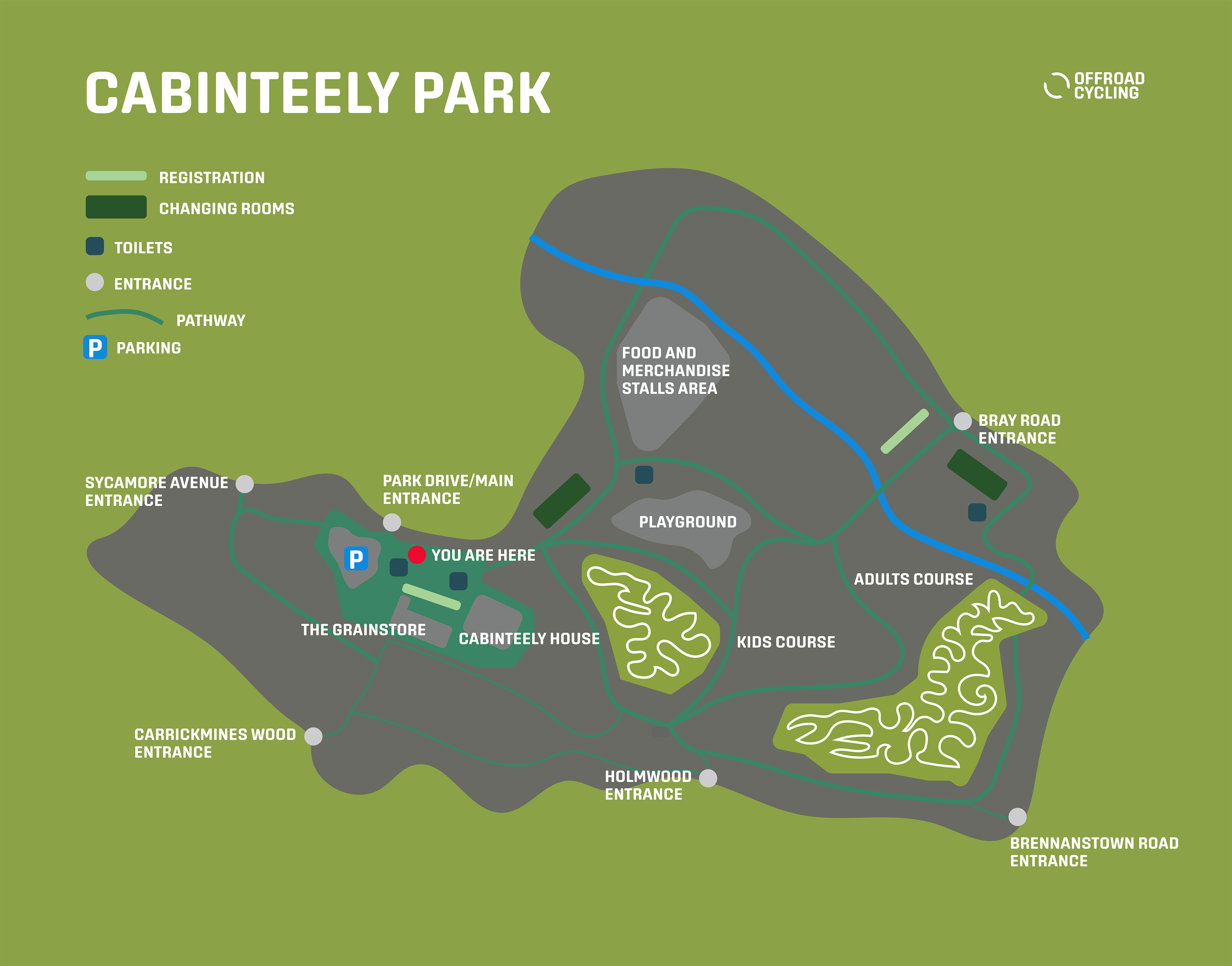
The event wayfinding system uses the graphic form seen in the print material. It is clear, fun and easy to read from a distance. Event organisers can request the signage from Cycling Ireland making cycling events across the country easier to run. Whether it's a cyclocross race in a Dublin city park or a rural road race in the West of Ireland, the signage will be the same quality and aesthetic.
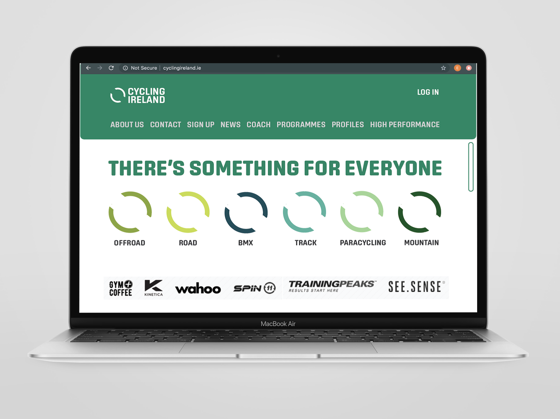
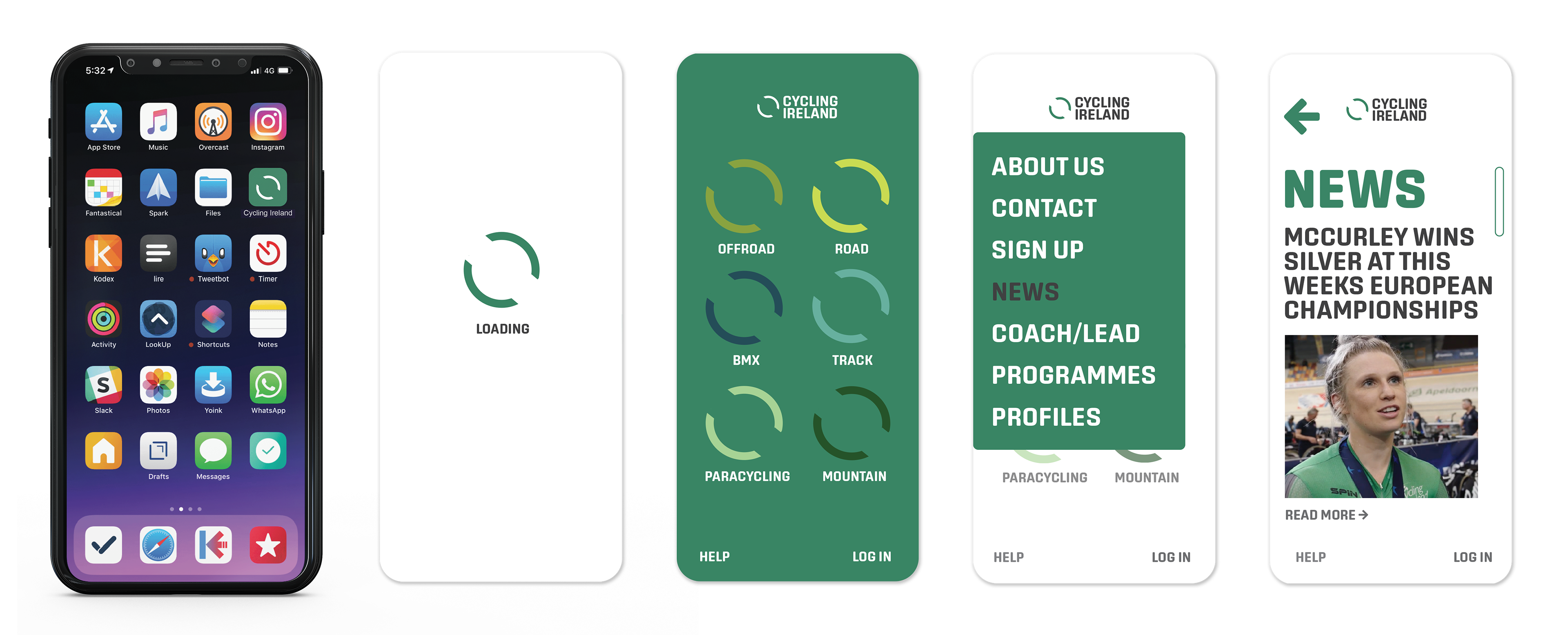
What stood out the most in interviews with current Cycling Ireland members was their frustration with the website and app. Users found the old website overwhelming and unclear and the app barely functioned. The new app the solves any confusions members had, with some additional helpful features. The app has the same home menu system as the desktop site. It helps users navigate between disciplines with ease.
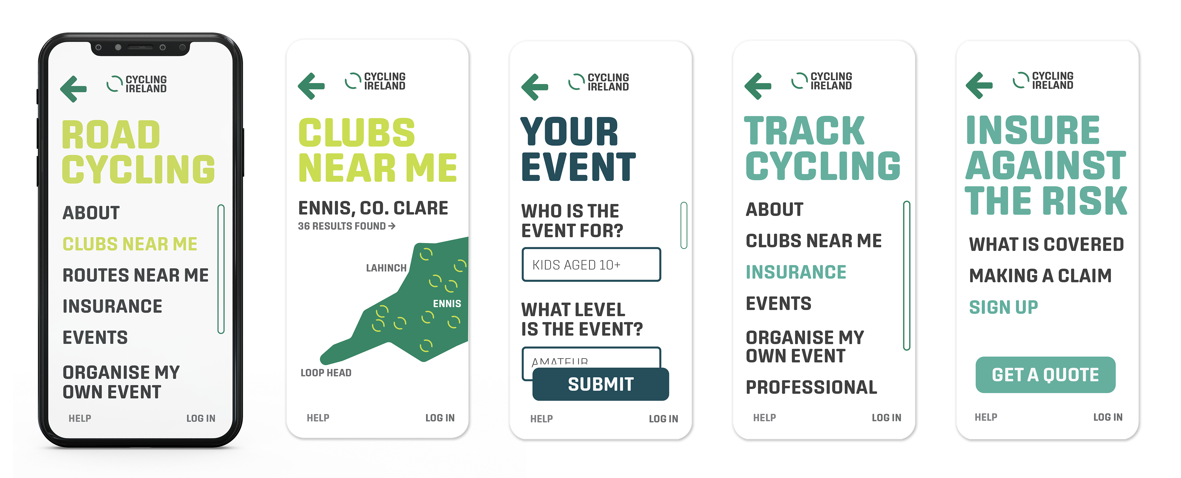
The app finds cycling clubs and routes near the user's location within their selected disciplines. This rules out the hassle of stumbling across a BMX club when you are looking for a road cycling club and so on. This also enables someone visiting from a different county to find a club to train with, which is a common practice.
An important feature is how easy it is to apply for help with organising an event, streamlining this process for both Cycling Ireland and the user. There was lots of confusion amongst current members surrounding insurance and what exactly is covered under a Cycling Ireland policy. Each discipline has its own insurance section to avoid getting mixed up between disciplines. Quotes and claims have also been simplified.
"The simplicity, openness and versatility of the logo won us over.
The copywriting really fit what we do as an organisation and the system is excellent because it is flexible but keeps all types of cycling in one big family."
The copywriting really fit what we do as an organisation and the system is excellent because it is flexible but keeps all types of cycling in one big family."
- The Cycling Ireland Team